
Dashboard Example Guide
Power BI Dashboard Examples That Improve Meetings, Reporting, and Decisions
Looking for Power BI dashboard examples? This guide shows why some dashboards do far more than display numbers. The best examples improve how teams review performance, run weekly meetings, discuss problems, and move toward action.
Popular dashboard example types
Many people search for Power BI dashboard examples when they want design ideas. But in practice, a useful example should do more than inspire a layout.
A dashboard affects what happens after the screen appears. It changes how quickly people understand performance, how long meetings stay stuck in explanation, and whether the report leads to clearer business action.
What makes a useful dashboard example?
The best examples are not simply polished. They reduce ambiguity. They clarify KPI priority. They help people see what matters first before discussion turns into more reporting and more analysis.
Clear KPI priority
Strong examples do not treat every number equally. They show which metrics deserve immediate attention first.
Readable business context
Better examples make performance easier to interpret. Is the result healthy, weak, improving, or at risk?
Support for action
The most useful dashboards help teams move from reporting status toward aligned next-step discussion.
Power BI dashboard examples by use case
These Power BI dashboard examples show different review outcomes: dashboards that create noise, dashboards that improve readability, and dashboards that actively support better KPI review and business decisions.
Power BI KPI dashboard example with too many competing visuals
This style is common: many KPI cards, many lines, many visuals. It may look information-rich, but often leaves the team asking the same question: where should we even start?
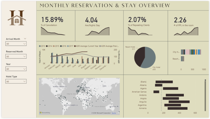
- Many visuals compete for attention
- Harder to identify review priority quickly
- Meetings often drift into interpretation
- Frequently leads to more follow-up analysis
Cleaner Power BI KPI dashboard example with better readability
This example is easier to scan and more structured than overloaded dashboards. It improves readability, but still benefits from stronger guidance around thresholds, drivers, and where attention should move first.
- Cleaner than overloaded dashboards
- Good base for KPI review
- Still may leave interpretation to the meeting
- Useful bridge toward stronger decision support
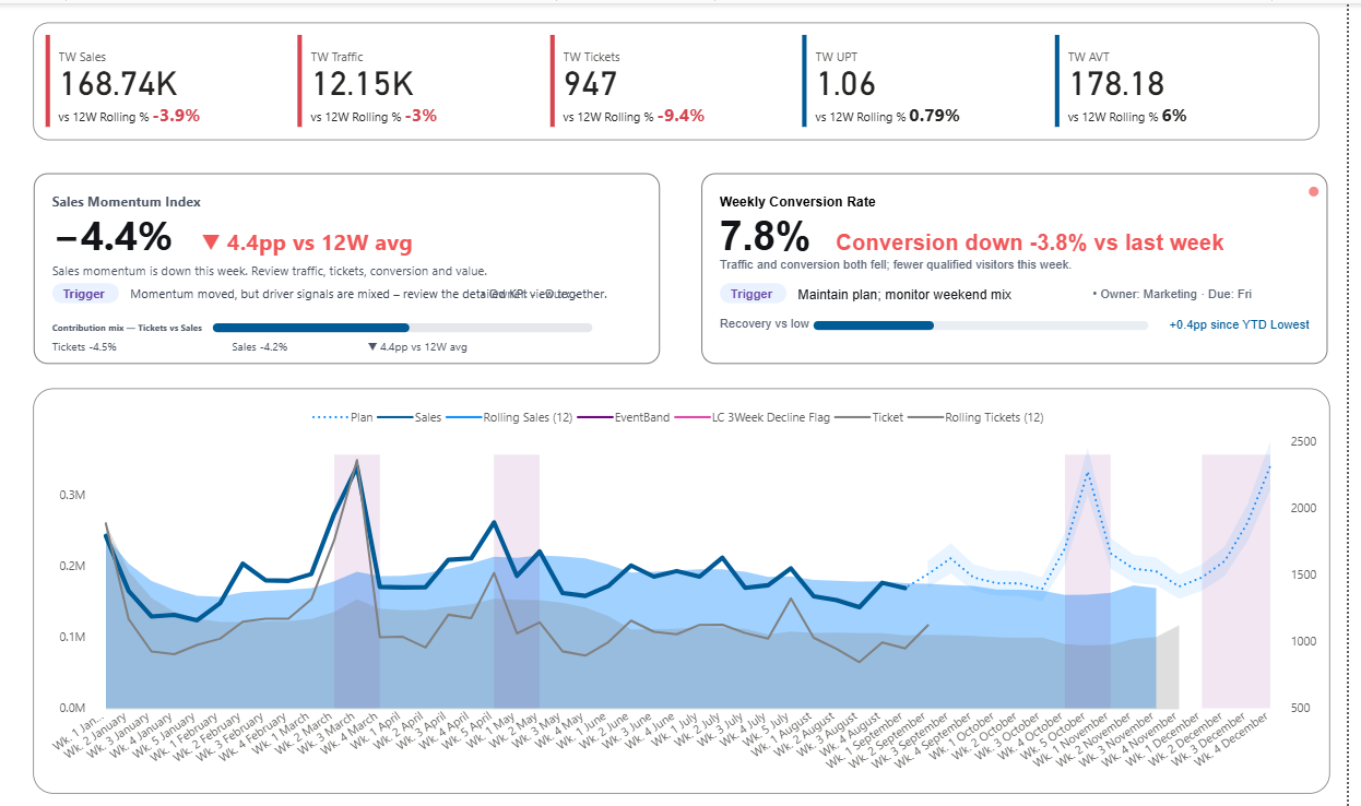
Decision-ready sales dashboard example
This example is built for weekly review quality. Instead of simply showing more metrics, it highlights KPI condition, key drivers, and the business conversation that should happen next.
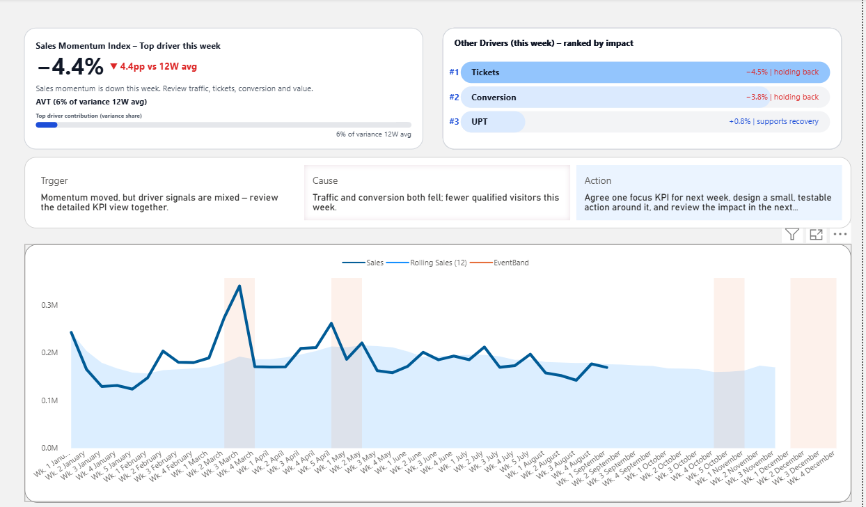
- Shows KPI condition rather than only raw values
- Highlights top drivers behind movement
- Improves how meetings focus attention
- Makes reporting more useful before discussion expands
Common Power BI dashboard examples teams search for
Many people looking for dashboard examples are also trying to understand which dashboard structure fits their situation best. Different teams use dashboards for different review conversations.
KPI Dashboard Examples
Focuses on quickly understanding KPI status and whether performance is improving, stable, or at risk.
View KPI Dashboard ExamplesSales Dashboard Examples
Used for reviewing revenue performance, conversion changes, pipeline movement, and weekly commercial results.
View Sales Dashboard ExamplesWeekly Business Review Dashboard
Designed to support structured performance reviews where teams discuss what changed, why it changed, and what action should follow.
View Weekly Business Review DashboardExecutive Dashboard Examples
Built for leadership review. Helps executives see what needs attention first, what is becoming risky, and where business discussion should begin.
View Executive Dashboard ExamplesChoose the dashboard path that fits your use case
The same decision-ready structure can be used in different ways. Choose the path that best matches what you want the dashboard to improve first.
Path 1
Power BI Sales Dashboard
Best if you want to improve sales performance review, KPI visibility, driver discussion, and how weekly commercial meetings focus attention.
- Sales KPI condition
- Driver visibility
- Weekly reporting clarity
- Template-oriented path
Path 2
Weekly Business Review Dashboard
Best if you want to improve how leadership reviews performance each week, reduce meeting drift, and make reporting lead more naturally to next-step discussion.
- Weekly meeting structure
- Trigger, cause, and action flow
- Review-focused dashboard design
- Decision-ready discussion support
Path 3
Executive Dashboard Examples
Best if you want a dashboard structure for executive review: faster scanning, clearer KPI priority, stronger signal visibility, and better leadership discussion flow.
- Leadership review focus
- KPI priority visibility
- Signal and risk awareness
- Executive discussion support
Interactive dashboard preview
Explore the live Power BI preview to see how KPI signals, driver visibility, and weekly review structure work together in a real dashboard.
This preview shows the interactive report structure. The template path provides the editable Power BI file and the product context around how to use it.
Typical dashboard examples vs decision-ready dashboard examples
Many example pages stop at visual inspiration. But the deeper question is whether the layout improves reporting quality and helps teams move toward better decisions.
Typical example pages
- Focus on layout and chart variety
- Show more visuals instead of stronger priority
- Emphasize appearance more than review structure
- Leave interpretation work to the meeting
- Often increase explanation effort
Decision-ready examples
- Show what deserves attention first
- Make KPI condition easier to interpret quickly
- Bring likely drivers into the review
- Improve reporting clarity before discussion grows
- Support better next-step alignment
Why sales dashboard examples are often the most revealing
Sales dashboards make dashboard quality easier to judge. They sit close to weekly action, changing targets, pipeline pressure, traffic quality, conversion shifts, and business trade-offs.
That means a weak layout quickly creates meeting friction. A strong layout makes it easier to review what changed, why it changed, and what deserves action next.
- Top-line performance is easy to compare
- Driver signals are easier to surface clearly
- Weekly decisions are easier to design around
- The value of better structure becomes obvious fast
Frequently asked questions about Power BI dashboard examples
These are some of the most common questions people ask when looking for useful dashboard examples in Power BI.
What are good Power BI dashboard examples?
Good Power BI dashboard examples do more than look polished. They make KPI priority easier to understand, reduce confusion in meetings, and help teams move toward clearer business action.
What is the difference between a KPI dashboard and a sales dashboard?
A KPI dashboard focuses on overall performance signals and metric condition. A sales dashboard usually goes deeper into revenue, conversion, pipeline movement, and commercial review.
What makes a dashboard example decision-ready?
A decision-ready dashboard example helps teams see what matters first, why performance changed, and where the business discussion should begin next.
Which dashboard example is best for weekly business review?
A weekly business review dashboard is usually the best choice when teams need a structure for reviewing performance, discussing drivers, and aligning around next-step action each week.