
Dashboard Components
Is Your KPI Dashboard Actually Working? KPI Dashboard Examples That Help You Decide
Your dashboard is probably not wrong.
It includes the KPIs that were requested. The numbers are accurate. The layout is clean and readable. From a reporting perspective, it works.
And yet, something feels off when you look at it.
You are not completely sure if it is actually easy to understand. You are not sure if users know where to look first. You are not even sure if it really helps anyone decide what to do next.
This is a common situation for people who build dashboards. Not because they lack skill, but because “a correct dashboard” and “a useful dashboard” are not always the same thing.
In this article, we will look at KPI dashboard examples from a different perspective — not just how they look, but how to tell whether they are actually working.
Why it is hard to know if a KPI dashboard is good
One of the most difficult parts of building dashboards is that the request often starts with a list of KPIs. Someone tells you what needs to be included. Sales. Conversion. Traffic. Margin. Inventory. Customer count. Forecast accuracy. The list grows quickly, and each KPI sounds reasonable on its own.
I have been in that situation many times. You build the dashboard carefully. You place the KPI cards, organize the charts, adjust the layout, and try to make the page clean. Then the review begins, and more requests appear. Can we add this KPI? Can we split it by channel? Can we compare it with last year? Can we show another trend?
None of those requests are wrong. That is what makes the problem difficult. Each request has a reason. But after enough additions, the dashboard starts to feel crowded. It may still be technically correct, but you no longer know whether it is actually helping the team decide.
That is the real question behind many searches for KPI dashboard examples. People are not only looking for inspiration. They are trying to understand what a good KPI dashboard should do.
A useful KPI dashboard example should help you judge:
- whether the most important KPI is easy to find
- whether the dashboard shows what needs attention first
- whether supporting charts explain the KPI or simply add more information
- whether the dashboard helps the meeting move toward a decision
A KPI dashboard is not good just because it has many KPIs
This is where many dashboards begin to fail quietly. They do not fail because the data is wrong. They fail because too many KPIs are treated as equally important.
When every KPI is given the same visual weight, the viewer has to decide what matters by themselves. The dashboard may look complete, but the burden of interpretation is pushed back onto the meeting. People scan the page, compare numbers, ask for context, and eventually start rebuilding the story in discussion.
A better KPI dashboard does not simply display more. It helps narrow attention. It makes the priority easier to see before the room starts debating it.
A KPI dashboard is working when it helps people understand what deserves attention, not just what can be measured.
What you should look for in KPI dashboard examples
When you look at KPI dashboard examples, it is tempting to focus on the surface first. The colors, spacing, card design, and chart style are easy to compare. Those details matter, but they are not the real test.
The better question is whether the dashboard helps answer the questions that appear in a real meeting. Is performance good or bad? Is the change serious? What is probably causing it? Which KPI should we discuss first? What should happen next?
If the dashboard cannot help with those questions, it may still be visually polished, but it is not yet doing the harder work.
- Does the dashboard show the current condition clearly?
- Does it separate important signals from background noise?
- Does it connect the KPI to possible drivers?
- Does it reduce confusion before the meeting expands into analysis?
- Does it help the team decide what to review or test next?
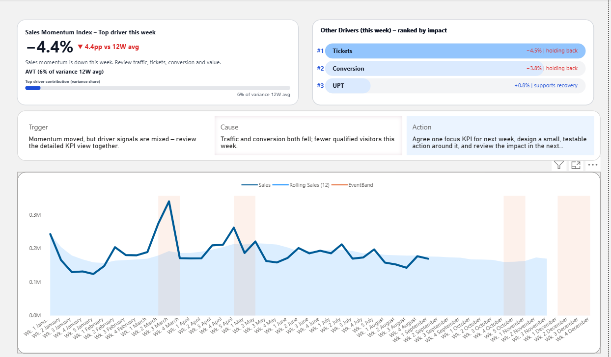
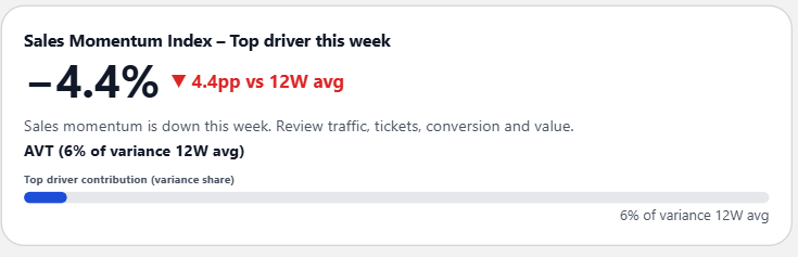
Example 1: A KPI card that shows the signal
The first example is a KPI card that does more than show the current value. It shows whether the KPI needs attention.
This matters because many dashboard discussions begin with uncertainty. A number has changed, but the team does not immediately know whether the change is normal, concerning, or urgent. Without a signal, the first part of the meeting is spent deciding whether the KPI deserves attention at all.
A signal card reduces that delay. It gives the viewer a first interpretation: this KPI is not just a number; it is a condition.
This is especially useful when the dashboard has many requested KPIs. Not every KPI needs the same level of attention every week. A signal helps the team avoid treating every number as equally important.
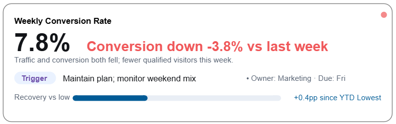
Example 2: A KPI card that points to the likely driver
Once a KPI needs attention, the next question comes quickly: why?
This is where many dashboards become hard to use. The KPI card shows the result, but the reason is somewhere else. The team has to open another chart, change filters, compare categories, export data, or wait for someone to explain the story.
The second example brings the likely driver closer to the KPI itself.
This kind of card is useful because it does not pretend that the dashboard knows everything. It simply gives the meeting a better starting point.
Instead of asking, “What happened?” from zero, the team can begin with a more focused question: “Is this driver the reason, and what should we test next?”
Example 3: A driver card that helps organize too many KPIs
When stakeholders keep asking for more KPIs, the dashboard often becomes crowded because every metric is added as another card. But sometimes the better solution is not another KPI card. It is a driver card.
A driver card helps organize the factors influencing performance. It gives the team a way to see which drivers are supporting the result and which ones are pulling it down.
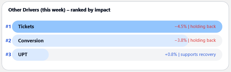
This matters because a dashboard filled with KPI cards can tell you that many things are changing, but it may not tell you which changes matter most.
A driver card helps create hierarchy. It turns a long list of possible metrics into a more useful view of what is influencing the business.
How to know if your KPI dashboard is actually working
A KPI dashboard is working when it makes the next conversation easier. Not shorter in a superficial way, and not simpler by hiding complexity, but easier because the structure gives people a better place to start.
In practice, that means the dashboard should help people move through a clear path: what changed, whether it matters, what likely caused it, and what should be reviewed next.
If the dashboard cannot support that path, people will create their own workaround. They will export data, build their own Excel view, prepare extra slides, and explain the numbers again in the meeting. That is often the sign that the dashboard is visible, but not yet useful enough for decision-making.
Your KPI dashboard is probably working if:
- people know where to look first
- the most important KPI is visually and logically clear
- supporting visuals explain the KPI instead of competing with it
- the dashboard reduces the need for repeated Excel analysis
- the meeting moves from explanation toward action
What these KPI dashboard examples show together
The three examples are small, but they point to a larger idea. A good KPI dashboard is not just a collection of cards. It is a structure for attention.
The signal card helps the team see what needs attention. The driver signal card helps connect the KPI to a possible cause. The driver card helps organize the factors that influence the result.
Together, they show how a dashboard can move beyond reporting and become more decision-ready. It does not need to answer every question, but it should reduce the number of questions the team has to rebuild from scratch.
FAQ about KPI dashboard examples
What makes a KPI dashboard example useful?
A useful KPI dashboard example helps you understand how the dashboard supports decisions. It should show not only KPI values, but also signals, context, drivers, or some structure that helps people know what to discuss next.
How do I know if my KPI dashboard is good?
A good KPI dashboard makes it easier to understand what needs attention and what action should be considered. If people still need to rebuild the story in Excel before every meeting, the dashboard may be showing data without enough decision structure.
How many KPIs should a KPI dashboard include?
There is no fixed number, but every KPI should have a clear purpose. If a KPI does not help the team monitor performance, understand a driver, or make a decision, it may be adding noise rather than clarity.
What is the difference between a KPI card and a KPI dashboard?
A KPI card is one component. A KPI dashboard is the full structure that organizes KPI cards, drivers, context, and supporting visuals so that teams can review performance and decide what to do next.
Final thought
If you are not sure whether your KPI dashboard is good, that uncertainty is not unusual. Many dashboards are built from reasonable requests, useful metrics, and good intentions. The problem is that usefulness does not come from adding every KPI someone asks for.
A dashboard becomes useful when it helps people see what matters, understand why it matters, and move toward a better decision.
That is the difference between a dashboard that simply displays KPI numbers and a dashboard that actually works.