
Power BI Templates, Examples & Decision-Ready Design
Power BI Dashboards Built to Show What Matters Next
Explore ready-to-use Power BI templates, practical dashboard examples, and clearer layouts for business reviews, KPI tracking, sales analysis, and executive reporting.
- • See what changed without scanning every KPI
- • Connect performance signals to likely drivers
- • Give teams a clearer starting point for discussion
Start with what you need
Explore DataDes by use case
See real dashboard examples, start from a ready-to-use template, or explore a clearer structure for weekly reviews and decision meetings.
Popular resources
Find the dashboard example closest to your goal
Start with the dashboard type or business question you are already working on.
Power BI Dashboard Examples
Explore layouts that make performance easier to understand and discuss.
View examples →Sales Dashboard Templates
Compare sales, KPI, and performance reporting layouts designed for real meetings.
View sales dashboards →Weekly Business Review
Turn recurring reporting into a clearer decision conversation.
See the review structure →Decision Dashboard Examples
See how dashboards can guide attention, diagnosis, and action.
View decision examples →Why DataDes
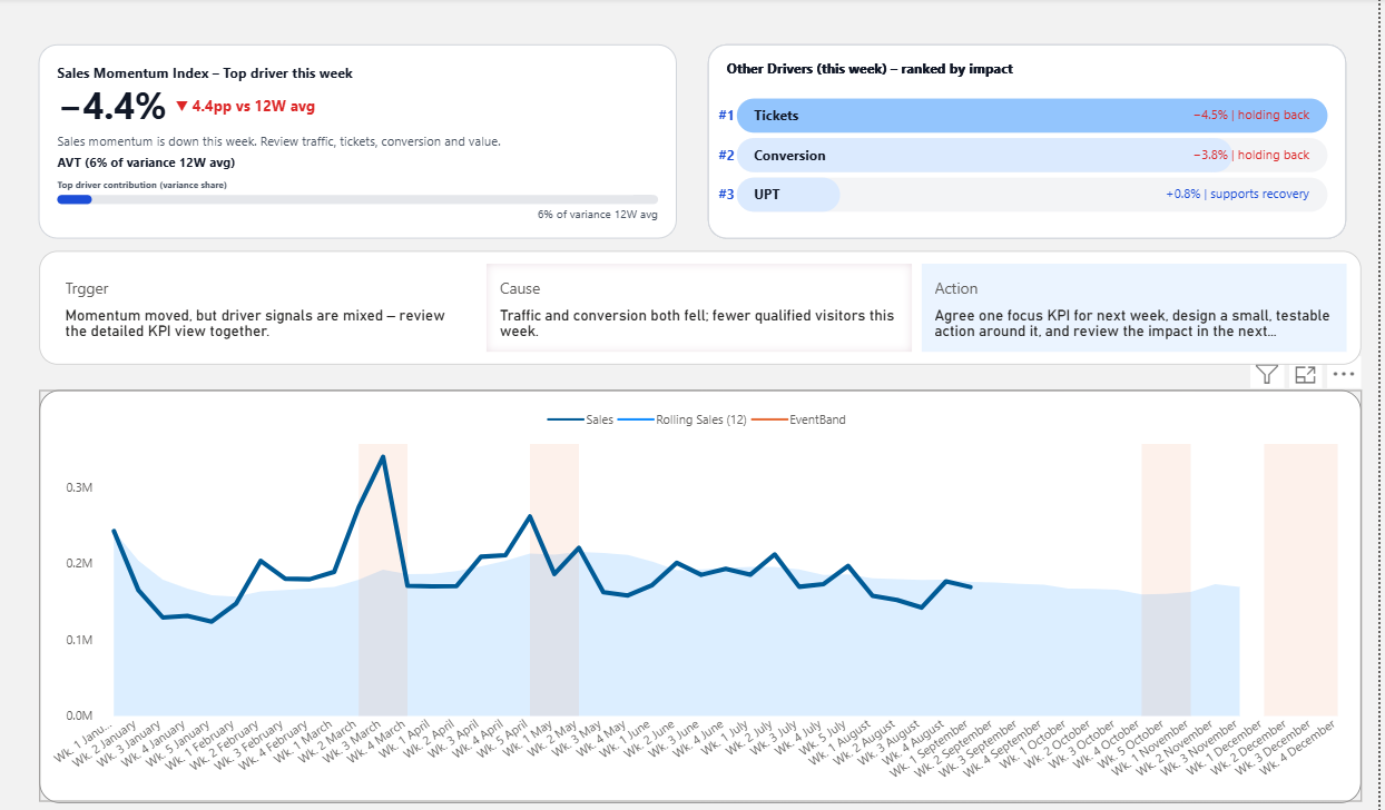
A dashboard should do more than display numbers
Many dashboards are technically correct but still difficult to use. They show data without making it clear where attention should go first.
DataDes focuses on the structure behind useful dashboards: the signal, the reason it matters, the likely driver, and the next point of discussion.
Signal
Show what changed and whether it deserves attention.
Driver
Connect KPI movement to the factors most likely causing it.
Action
Help teams understand what should be discussed or done next.
What makes the approach different
From reporting completeness to decision clarity
Typical dashboard
- •Many visuals compete for attention
- •KPIs appear equally important
- •Users interpret the meaning themselves
- •Meetings depend on long verbal explanation
Decision-ready dashboard
- •Important change is visible first
- •Context explains why it matters
- •Likely drivers guide investigation
- •Discussion moves toward action faster
Ready-to-use Power BI template
Start with a dashboard already built around focus
Use a decision-ready Power BI template for business reviews, KPI tracking, performance analysis, and executive reporting.
- •Signal layer: show what changed
- •Driver layer: show what may be causing the change
- •Action layer: show where discussion should move next
- •Meeting layer: align the team around the same starting point
Who DataDes is for
Built for people who need clearer business decisions
Managers
Run more focused reviews around what changed, why it matters, and where the team should focus next.
Dashboard users
Understand performance faster without scanning every chart equally.
Analysts and developers
Design around hierarchy, interpretation, and action—not only visual polish.
Choose your next step
See the examples first, then choose the right starting point
Explore real Power BI dashboard examples or begin with a ready-to-use template.
After the template
A better template is a starting point. But the deeper issue is usually not design alone. Many dashboards feel difficult to use because they do not guide attention when the business changes. That is where Decision OS comes in: it connects signals, drivers, and actions so teams can move from insight to decision with a shared starting point.
Explore the Decision OS →If your dashboard still feels hard to use, start with the symptom.
The right solution depends on where the confusion appears: in meetings, KPI focus, or last-mile analysis.
Meetings review numbers, but no one decides what to do next.
The dashboard is visible, but the discussion still ends with “Let’s monitor again next week.”
Start with this symptom →KPIs keep growing, but focus keeps shrinking.
Every metric looks important, so the team cannot easily agree where to look first.
See why this happens →Dashboards exist, but people still export to Excel.
When decisions feel easier in spreadsheets, the dashboard is not carrying enough decision structure.
Fix the structure →Decision Latency
Not sure how much delayed decisions are costing you?
A cluttered dashboard does not only slow down analysis. It can delay decisions, extend review cycles, and keep teams debating the same signals week after week. Before redesigning another report, estimate the cost of hesitation already built into your review process.
Takes less than 2 minutes. No email required.
In a typical month you might be losing…
$245,400
from extended reviews, misaligned reactions, and “let’s monitor next week.”
- Weekly dashboard reviews with 6–10 people
- Re-reading the same KPIs without clear triggers
- Actions delayed by 2–3 weeks after the first signal
The calculator uses your own numbers to surface this hidden cost.
A better dashboard should not just show what changed.
It should reduce the “Where do we start?” moment by giving the team a clearer path: signal → driver → action. This is the practical logic behind the Decision OS framework.
The goal is not to add more visuals. The goal is to turn scattered information into a shared starting point for discussion and action.
When performance drops, the answer should already be there.
Performance drops, everyone looks at you...
The room gets quiet.
More data appears.
Still, no one starts.
When the starting point isn't clear,
effort increases. Alignment doesn't...
AI explains options. Dashboards define priority.
AI explains options. Dashboards define priority. The Decision OS framework creates the shared starting point that teams use before deciding what action comes next.
AI can generate insights fast. That’s not the bottleneck.
The bottleneck is the moment a team must choose: “Where do we start?”
Decision-ready dashboards create that starting point—so the next move is less political, and more obvious.
Understand the full framework
Most dashboards generate insights. Few actually help teams decide.
The White Paper explains the missing layer between data insight and real business decisions.
Read the White PaperWhat it changes
It gives teams a shared starting point.
Not “more KPIs.” Not “more analysis.” Just a clear path from signal → driver → action.
Fixes where to look first
One metric represents success. When it moves, everyone knows: “This is where we start.”
Explains why it moved
A small set of driver KPIs narrows the search—so teams stop debating symptoms and investigate causes.
Makes the next action obvious
Triggers and owners are defined in advance. When the dashboard fires, people know what happens next.
Fit check
Who this is for — and who it isn’t.
If the left sounds familiar, you’re in the right place.
This is for you if:
- •Dashboards are used, but action is inconsistent.
- •Meetings debate numbers more than decisions.
- •You need alignment on what matters first.
- •You own outcomes as a leader, analyst, or consultant.
This is not a fit if:
- •You only want chart design tips.
- •Your dashboard is purely for reporting.
- •You don’t want to change how decisions happen.
- •You believe more KPIs always helps.
Start where it makes sense for you.
Choose the next step based on what you need right now: clarity, structure, or an external review.
Self-Serve Architecture
Production-ready Power BI templates and Deneb visuals designed with decision architecture. Customize, learn, and understand how better dashboards improve judgment.
- Visual Gallery — See what "Good" looks like
- Templates — Browse Power BI Templates
- Self-Learning Blog —Learn the system
Coaching & Strategy Support
Create dashboards that move people to action. From NSM alignment to KPI architecture, we help your team design dashboards that support real decision-making.
- Sample Dashboards — See decision-ready examples
- Coaching & Consultation — tailor it to your team’s workflow
Frequently Asked Questions
You get a premium Power BI template built on a decision-ready structure—clear starting point, driver set, and next-action path—plus guidance to customize without breaking the flow.
The format is listed on each template page. Yes—you can customize fields, measures, labels, and layout while keeping the decision structure intact.
Only if the template uses them. If required, it’s stated clearly on the template page, and setup is straightforward.
The Decision Check is a free, 2–3 minute self-check.
It helps you identify why your dashboard isn’t leading to decisions — whether the issue is clarity, structure, or next actions.
This is not about tools or visuals.
It’s about understanding what problem you actually have before you try to fix it.
No.
While examples may reference Power BI, the Decision Check focuses on decision structure, not tools.
If your team:
-
looks at the same numbers but disagrees on actions
-
tracks KPIs but nothing changes
then this applies — regardless of the BI tool.
In a Diagnosis, we apply the Decision Check insights directly to your dashboard.
You’ll get:
-
A clear explanation of what’s blocking decisions
-
Structural recommendations (not cosmetic tweaks)
-
Guidance on what to change first — and what to ignore
This is for people who want clarity, not just opinions.
The Decision Check does not sell you anything.
It simply shows you:
-
where you are
-
what kind of help (if any) makes sense next
Some people stop at the free check.
Others move on when the cost of confusion is higher than the cost of fixing it.