
Power BI Dashboard Template Guide
Best Power BI Dashboard Templates You Can Actually Use in Real Meetings
Many Power BI dashboard templates look impressive in screenshots, but become difficult to use once real meetings begin. Teams still spend too much time explaining KPI changes, debating what matters most, or reopening Excel to answer follow-up questions.
Built for teams that need Power BI dashboards they can review, present, and actually use during KPI meetings.
Many Power BI dashboard templates look impressive in screenshots, but become difficult to use during real business reviews.
Teams still spend meetings searching for the right KPI, debating what changed, or exporting the data back into Excel for deeper analysis.
The templates on this page are designed differently. They are built to help teams review performance, recognize important signals, and decide what deserves attention next.
Best Power BI Dashboard Templates: Quick Picks
If you are comparing Power BI dashboard templates, start with the meeting use case first. The best template is not always the most visually complex one. It is the one that makes the review easier, faster, and clearer.
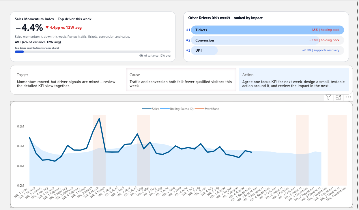
Best for weekly sales review
Sales Dashboard Template
Best when you need to review sales movement, KPI status, and recent performance without turning the meeting into a long explanation session.
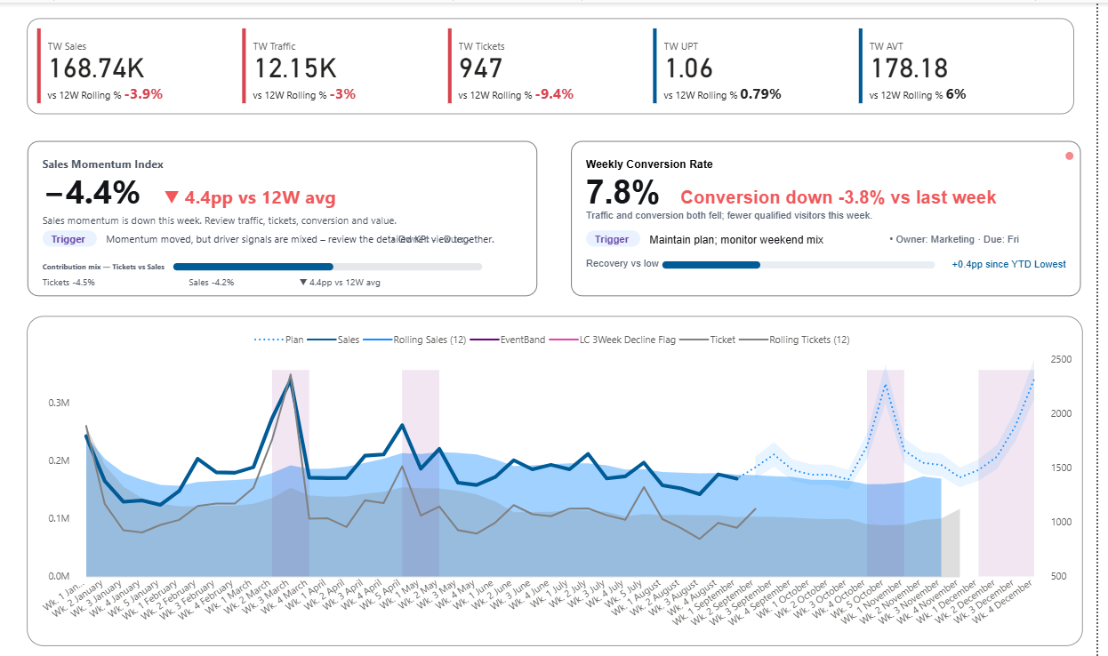
Best for KPI tracking
KPI Dashboard Template
Best when you want a simple way to track KPI movement, compare status, and make performance easier to understand at a glance.
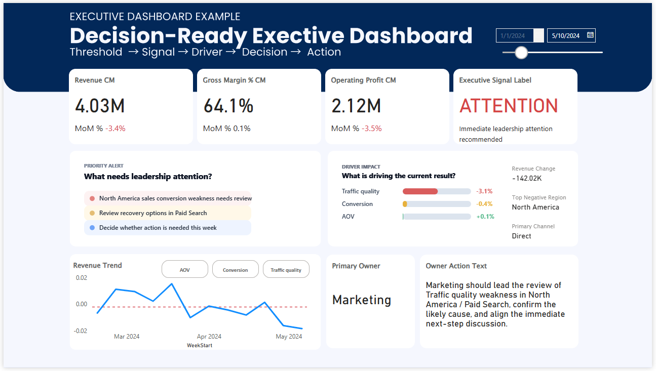
Best for leadership review
Executive Dashboard Template
Best when leaders need fewer details, stronger prioritization, and a clearer view of what needs attention first.
Try the dashboard before you choose it
Many template pages only show screenshots. But screenshots do not always tell you whether a dashboard will work in a real meeting. Use the interactive preview below to see how the layout feels before choosing a template.
Interactive preview of the Power BI sales dashboard template.
Compare Power BI templates by how they work in meetings
A dashboard template can look professional and still be hard to use when people need to discuss performance quickly. These examples show the difference between visual complexity, clean reporting, and a dashboard layout built for focused review.
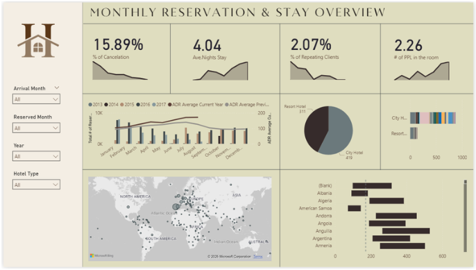
Busy visual-first dashboard
Many KPI cards, many charts, many colors. It may look active, but it often asks the viewer to do more interpretation work during the meeting.
Cleaner KPI dashboard
Easier to scan and easier to present. A useful step forward when you want a neater reporting layout without too much visual noise.
Meeting-ready dashboard template
A stronger option when you want KPI condition, recent movement, and business discussion to feel connected in one screen.
Why this template feels easier to use
Designed for the moment when people actually discuss performance
In practice, people are not just looking for a prettier Power BI dashboard. They usually want a layout that is easier to scan, easier to explain, and easier to use when a team is sitting together trying to understand what changed.
- Top-line sales movement is easier to scan quickly
- KPI condition becomes more readable at a glance
- The dashboard is easier to present in weekly review
- The layout reduces repetitive explanation work
- Important signals are harder to miss during the meeting
Why many Power BI templates still feel hard to use
A template can look professional and still create friction. The usual problem is not a lack of charts. It is that the page asks too much from the viewer before the meeting can move forward.
Too many equal signals
When every KPI looks equally important, it becomes harder to know where to look first.
Too much explanation work
The presenter ends up doing too much of the dashboard’s job live in the meeting.
Good-looking but hard to review
Some templates are visually polished but still awkward when the discussion needs to move quickly.
Browse by what you need from the template
Some visitors want visual inspiration. Others want a Power BI template they can actually use in sales reviews, KPI meetings, or performance discussions. This page focuses on templates that are easier to use when other people need to understand the dashboard quickly.
If you are mainly browsing examples
- Compare more Power BI dashboard layouts
- See different dashboard styles
- Review KPI and executive examples
- Use examples for design inspiration
If you want a template for real meetings
- See a live preview before choosing
- Use a cleaner weekly review layout
- Reduce reporting noise in meetings
- Move faster from KPI review to discussion