
Weekly Meeting Dashboard Guide
Weekly Business Review Dashboard: What to Show to Drive Better Meetings
Weekly meetings often feel repetitive or unclear. Not because teams lack data, but because no one knows what should actually drive the discussion.
This page shows a real dashboard example designed to make weekly business reviews clearer— and more importantly, what to show in your weekly business review to focus the conversation, highlight what changed, and move toward clear decisions.
A real Weekly Business Review dashboard example
Most people searching for a weekly business review dashboard want to see the actual layout first. Not a framework. Not theory. The real screen used in a meeting.
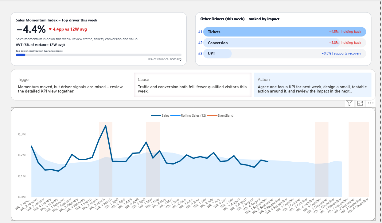
Most teams already have dashboards. The problem is not having one — it is not knowing what to focus on during the meeting.
This example is designed to help teams move beyond reporting and into better discussion.
What this dashboard helps reveal:
- which KPI needs attention first
- what changed versus recent trends
- which driver likely explains the change
- how the meeting can move toward action faster
Why weekly meetings don’t lead to decisions
Most weekly meetings don’t fail because of missing data. They fail because there is no clear structure for decision-making.
Too many KPIs
Everything looks equally important, so the team struggles to decide what to focus on first.
Too much explanation
People spend time explaining numbers instead of aligning on what actually matters.
No clear next step
The meeting ends with awareness, but no clear direction on what should happen next.
What a weekly business review actually needs
A better weekly review dashboard should not simply show more data. It should help the team answer the questions that normally slow the meeting down.
A useful weekly dashboard helps the team answer three questions quickly:
- What changed?
- Why did it change?
- What should we do next?
When these questions are not visible in the dashboard structure, the meeting has to create the structure manually through discussion. That is why weekly reviews often feel slow, repetitive, or unclear.
What to show in a weekly business review dashboard
The strongest weekly review dashboards do not treat every metric equally. They organize attention so the team can see condition, change, driver, and action direction more clearly.
Typical dashboard
- Many charts compete for attention
- KPI meaning is unclear
- Interpretation happens in the meeting
- Discussion starts slowly
- Action is left until the end
Decision-focused dashboard
- Shows what matters first
- Highlights meaningful change
- Brings drivers into view
- Guides the next discussion
- Helps the meeting move forward
Interactive dashboard preview
Explore the live Power BI preview to see how a weekly review dashboard can focus attention before the discussion begins.
This preview shows the dashboard structure in action. The template gives you an editable Power BI starting point for weekly review reporting.
Who this dashboard structure is for
This approach is useful when the dashboard already exists, but the meeting still feels unclear, repetitive, or slow to move forward.
For managers
Use the dashboard to focus the team on what changed, what matters, and where discussion should begin.
For dashboard users
Understand what to look at first, instead of trying to interpret every KPI equally during the meeting.
For dashboard developers
Build dashboards that support real review conversations, not just visual reporting requirements.
FAQ about Weekly Business Review dashboards
What is a Weekly Business Review dashboard?
A Weekly Business Review dashboard is a reporting layout used to support weekly KPI review meetings. It helps teams understand current performance, spot changes, and guide discussion more clearly.
What should a Weekly Business Review dashboard include?
A strong Weekly Business Review dashboard should include KPI condition, recent change, trend context, likely drivers, and enough structure to help the team decide what deserves attention first.
Why do weekly review meetings become repetitive?
Weekly review meetings often feel repetitive when dashboards show too many competing metrics, do not make priority clear enough, or leave too much interpretation to the presenter during the meeting.
How can dashboards improve weekly meetings?
Dashboards improve weekly meetings when they help the team focus on meaningful change, understand likely drivers, and move discussion toward a clearer next step instead of only reviewing results.
Next step
Use this structure in your own weekly dashboard
If you want a starting point, use the Power BI template built to reduce explanation, focus attention, and drive better weekly review meetings.