
Decisio nMaking Dashboard Guide
How to Build a Decision Making Dashboard That Actually Works
In many meetings, the dashboard is already on the screen.
The numbers are there. The charts are clear.
But within a few minutes, something starts to break.
One person focuses on revenue.
Another looks at margin.
Someone else points to a different trend entirely.
The issue is not that the data is missing.
It is that the starting point is unclear.
When a dashboard does not make signal, priority, and direction visible,
each person interprets the screen differently.
And the conversation splits before a decision can form.
A decision-making dashboard solves this in a different way.
It gives the team a shared starting point —
what matters now, what changed, and where the discussion should go next.
Why most dashboards still fail in meetings
Many dashboards do a good job of reporting numbers. Fewer do a good job of helping people decide what to do next. In real business reviews, the challenge is rarely access to data. The challenge is usually attention. People see different problems, focus on different metrics, and start different conversations.
That is why a decision-making dashboard needs to do more than summarize performance. It needs to help a group focus on the same signal, understand what changed, and move toward a shared next step.
HOW TO
How to build a decision-making dashboard that actually works
A decision-making dashboard is not built by adding more charts. It is built by making three things easier to see.
First, people need to recognize what deserves attention. Second, they need to understand what changed and why. Third, they need clarity on where the discussion should go next.
When these elements are missing, teams spend time interpreting data. When they are clear, teams can move directly into judgment and action.
- Signal: What needs attention right now?
- Context: What changed and what explains it?
- Direction: Where should we focus next?
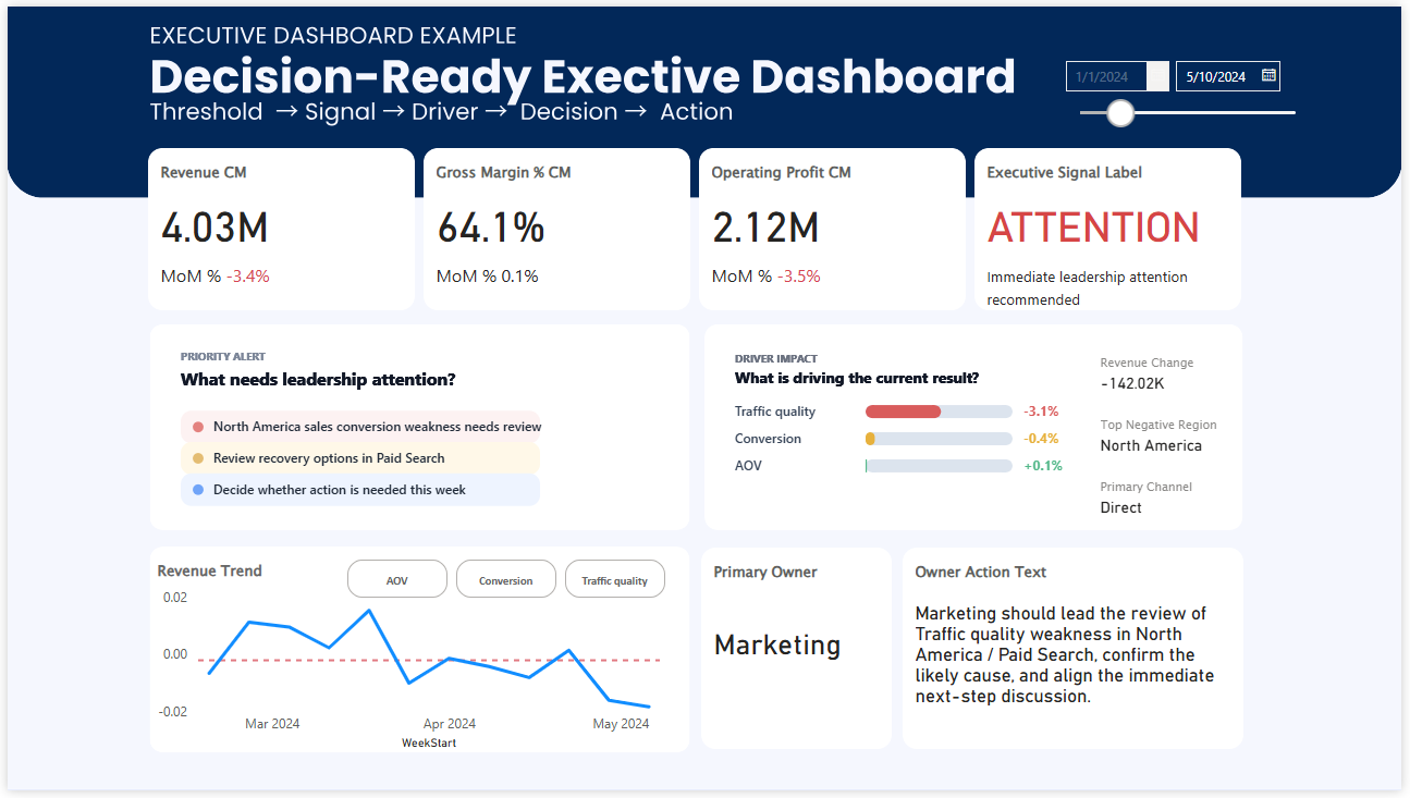
The rest of this page shows how these principles appear in real dashboard examples.
THE CORE PROBLEM
A dashboard that informs is not always a dashboard that helps people decide
AI tools can summarize what changed. BI tools can display trends. Analysts can explain the data. But even with all of that in place, many teams still leave meetings without clear alignment. That is because good decisions require more than visibility. They require shared attention.
A useful decision-making dashboard reduces the gap between seeing information and agreeing on action. It helps a team answer three questions faster:
What matters now?
Show the signal clearly enough that people recognize where attention should go first.
Why is it happening?
Provide enough context and driver direction to support real interpretation.
What should happen next?
Create a better starting point for discussion, prioritization, and action.
HOW TO BUILD IT
5 layers of a decision-making dashboard that actually works
The strongest dashboards are not just well designed. They are structured to support judgment under time pressure. These are the five layers that make that possible.
Start with the decision, not the chart
Before choosing visuals, define the real business decision the dashboard is supposed to support. Is the team trying to identify where performance is weakening? Prioritize which issue to discuss first? Decide whether intervention is needed this week? A dashboard becomes more useful as its decision purpose becomes more specific.
Make the signal visible before the detail
A team should not have to interpret five visuals before understanding whether something needs attention. Put the signal first. KPI cards, threshold states, variance highlights, and clear labels help people recognize condition quickly before they start exploring detail.
Connect the KPI to likely drivers
A metric by itself often creates more questions than answers. A stronger dashboard helps users move naturally from signal to cause. This does not mean explaining everything on one screen. It means making the first layer of interpretation easier by showing driver direction, priority, or contribution where it matters.
Design for the meeting context, not just for the screen
A dashboard may look clean in isolation but still fail in a real review setting. The true test is whether a team can use it to structure discussion. Weekly review dashboards and executive dashboards work better when they reduce drift, make attention easier to align, and help people move from observation to focused discussion.
Make action easier to discuss, not automatic to assume
A dashboard should support action without pretending to replace judgment. Instead of forcing one answer, a better dashboard makes the action conversation easier. It helps teams see which issue matters most, where the likely problem sits, and what kind of response needs discussion first.
A SIMPLE FRAMEWORK
Build around signal, context, and direction
If you want a practical way to evaluate whether your dashboard supports decision-making, start with these three questions.
Signal
Can people immediately tell whether something needs attention?
Context
Can they quickly understand what changed and what may be driving it?
Direction
Can the team begin a more focused discussion about what to do next?
WHAT THIS CHANGES
From reporting dashboard to decision-making dashboard
Typical dashboard
- Shows many KPIs at once
- Leaves interpretation to the viewer
- Looks complete but lacks priority
- Often starts scattered discussion
Decision-making dashboard
- Shows what deserves attention first
- Connects signal to likely drivers
- Clarifies discussion starting points
- Helps teams align faster in reviews
FINAL THOUGHT
A dashboard works better when it helps people agree where to look first
The strongest dashboards do not just answer questions. They help teams start from the same signal, move through the same context, and begin better decision discussions with less drift.