
Dashboard Example Guide
Interactive Power BI Dashboard Examples for Real Business Use and Better Decisions
Looking for real Power BI dashboard examples? Start with KPI, sales, and executive dashboard layouts you can actually learn from and use.
Power BI Dashboard Examples You Can Learn From
Start with real Power BI examples across KPI, executive, and sales use cases. These layouts are useful if you want cleaner structure, faster scanning, and better reporting flow.
Clean KPI dashboard example
This example shows a cleaner KPI dashboard layout with improved spacing, clearer grouping, and a structure that is easier to scan than overloaded dashboards.
- Cleaner KPI card layout
- Better readability at a glance
- Useful for reporting dashboards
- Good starting point for KPI design ideas
Executive dashboard example for leadership review
Executive dashboards need to reduce noise and improve scanning speed. This type of example is useful for leadership reporting, review meetings, and prioritizing attention quickly.
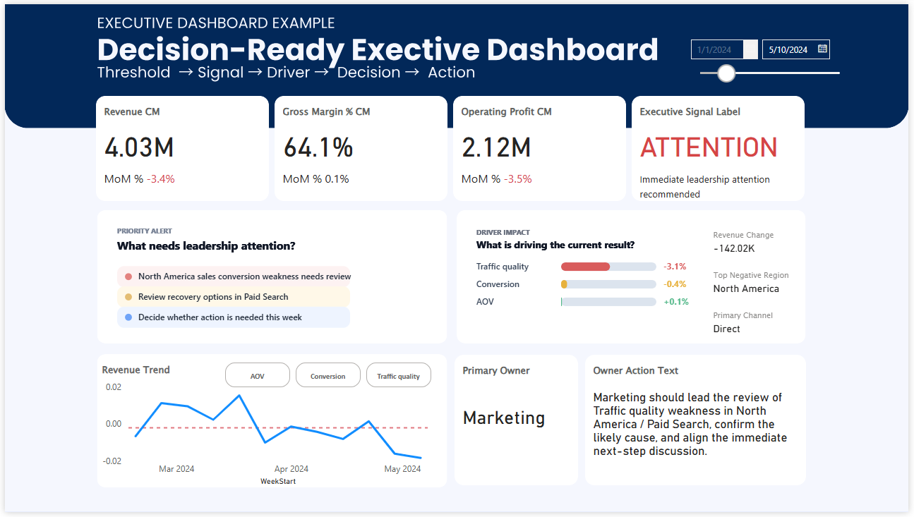
- Designed for fast leadership review
- Supports high-level KPI visibility
- Useful for executive reporting examples
- Helps reduce visual overload
KPI card example with signal visibility
Many dashboard searches are really searches for better KPI cards. This example shows how a KPI card can communicate condition more clearly instead of only showing a number.
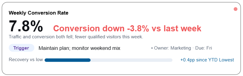
- Highlights KPI condition more clearly
- Useful for status-based reporting
- Better than plain number cards
- Strong example for KPI dashboard design
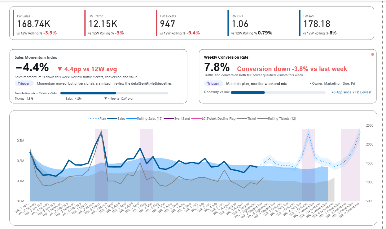
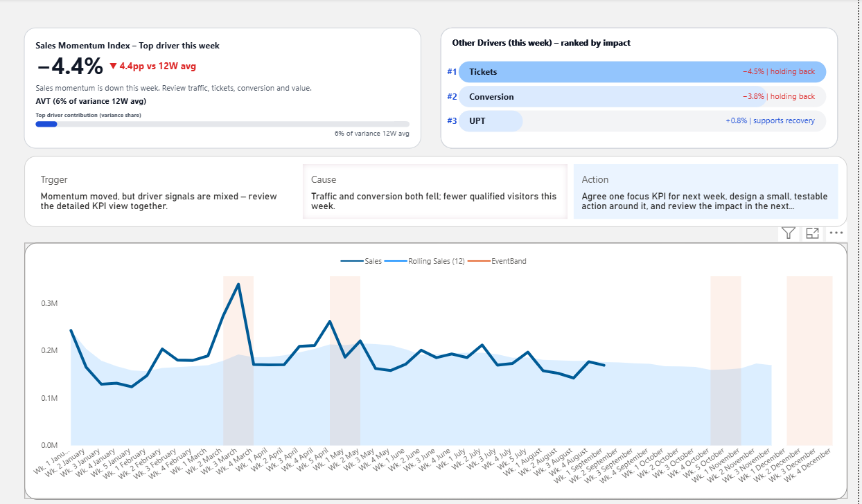
Dashboard example with driver priority
Some of the most useful dashboard examples go beyond summary metrics and help users see which drivers deserve attention first. This is especially useful in weekly business review and decision-focused reporting.
- Shows driver priority more clearly
- Supports faster interpretation
- Useful for review-focused dashboards
- Bridges KPI status and business discussion
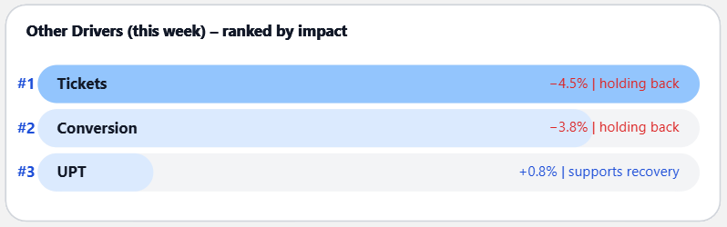
Decision-ready sales dashboard example
This sales dashboard example is useful when you want more than visual inspiration. It combines KPI status, driver visibility, and a structure that helps teams review performance more clearly.
- Useful for sales reporting examples
- Shows KPI condition more clearly
- Brings driver discussion closer to the dashboard
- Strong example for weekly review use cases
Popular example types
What people usually want from Power BI dashboard examples
Most searches for dashboard examples are not just about appearance. People are usually looking for layouts that are easier to read, easier to explain, and easier to use in real business reporting.
Cleaner layout ideas
Examples help people compare cluttered layouts with cleaner KPI-focused designs.
Practical dashboard structure
Strong examples show how sections, cards, trends, and drivers can be organized more clearly.
Better reporting flow
The best examples do more than look polished. They make performance easier to scan and discuss.
Power BI dashboard examples by dashboard type
Different examples are useful for different reporting needs. Choose the dashboard type that best matches what you want to improve.
KPI Dashboard Examples
Best for understanding KPI layout, status visibility, and cleaner metric design.
View KPI Dashboard ExamplesSales Dashboard Examples
Best for revenue, conversion, commercial review, and sales performance reporting.
View Sales Dashboard ExamplesWeekly Review Dashboard
Best for teams that want a stronger structure for weekly business review and performance discussion.
View Weekly Review DashboardExecutive Dashboard Examples
Best for leadership dashboards that need faster scanning and clearer priority.
View Executive Dashboard ExamplesHow to choose the right dashboard example
If you are browsing examples for inspiration, the best next step is to choose the use case that matches your reporting need most closely.
Path 1
For KPI dashboard ideas
Choose this path if you want cleaner KPI cards, better status visibility, and stronger at-a-glance reporting.
- KPI layout ideas
- Status-based design
- Metric readability
- Example-driven inspiration
Path 2
For weekly review dashboards
Choose this path if you want dashboards that support performance review, discussion flow, and clearer weekly reporting.
- Weekly business review
- Structured performance discussion
- Driver-oriented review
- Reporting flow improvement
Path 3
For executive dashboard examples
Choose this path if you want leadership dashboard ideas with stronger priority, cleaner structure, and more focused review flow.
- Executive reporting examples
- Leadership-friendly layout
- KPI prioritization
- Faster dashboard scanning
Interactive Power BI dashboard preview
If you want to go beyond static examples, explore the interactive preview to see how KPI signals, driver visibility, and dashboard structure work together in a live report.
This preview is helpful if you are comparing dashboard examples and want to see how a more structured Power BI report works interactively.
Typical dashboard examples vs stronger business dashboard examples
Many example pages stop at visual inspiration. Better examples also help people understand what makes a dashboard easier to use in real reporting situations.
Typical example pages
- Focus on layout only
- Show many visuals without clear priority
- Emphasize appearance more than usability
- Give inspiration but less reporting guidance
- Can still leave interpretation difficult
Stronger dashboard examples
- Are easier to scan quickly
- Make KPI visibility clearer
- Improve reporting readability
- Bring useful structure into the page
- Support clearer business review
Frequently asked questions about Power BI dashboard examples
These are some of the most common questions people ask when searching for dashboard examples in Power BI.
What are good Power BI dashboard examples?
Good Power BI dashboard examples are easy to scan, easy to understand, and useful in real reporting situations. The strongest examples combine clean layout, clear KPI visibility, and practical structure.
What kinds of Power BI dashboard examples are most useful?
KPI dashboards, sales dashboards, and executive dashboards are some of the most useful examples because they show different ways to organize performance reporting clearly.
What is the difference between a KPI dashboard and an executive dashboard?
A KPI dashboard focuses more on metric condition and performance visibility. An executive dashboard is usually designed for faster scanning, broader business review, and leadership discussion.
Can I use these Power BI dashboard examples as inspiration for my own report?
Yes. That is one of the main reasons people search for dashboard examples. They are useful for layout ideas, KPI card inspiration, structure comparison, and reporting design improvement.