
Decision-Making Dashboard Guide
Decision-Making Dashboard Examples: How Dashboards Actually Help People Decide
Most teams open a dashboard to find insight in the data. They look for patterns, changes, and explanations.
But something interesting happens in real business reviews. Even after finding insight, people still hesitate. They ask, “Is this a problem?” “Do we need to act?”
Insight alone does not create a decision.
A decision-making dashboard does something different. Instead of making people search for insight, it brings the signal forward — already structured, already interpretable — so the conversation can start with judgment — not with figuring out what the data means.
This page looks at decision-making dashboard examples through KPI cards, weekly review dashboards, and executive dashboards. The goal is not just to collect nice-looking layouts. It is to show what makes a dashboard useful when time is short, attention is limited, and people need to know where to focus first.
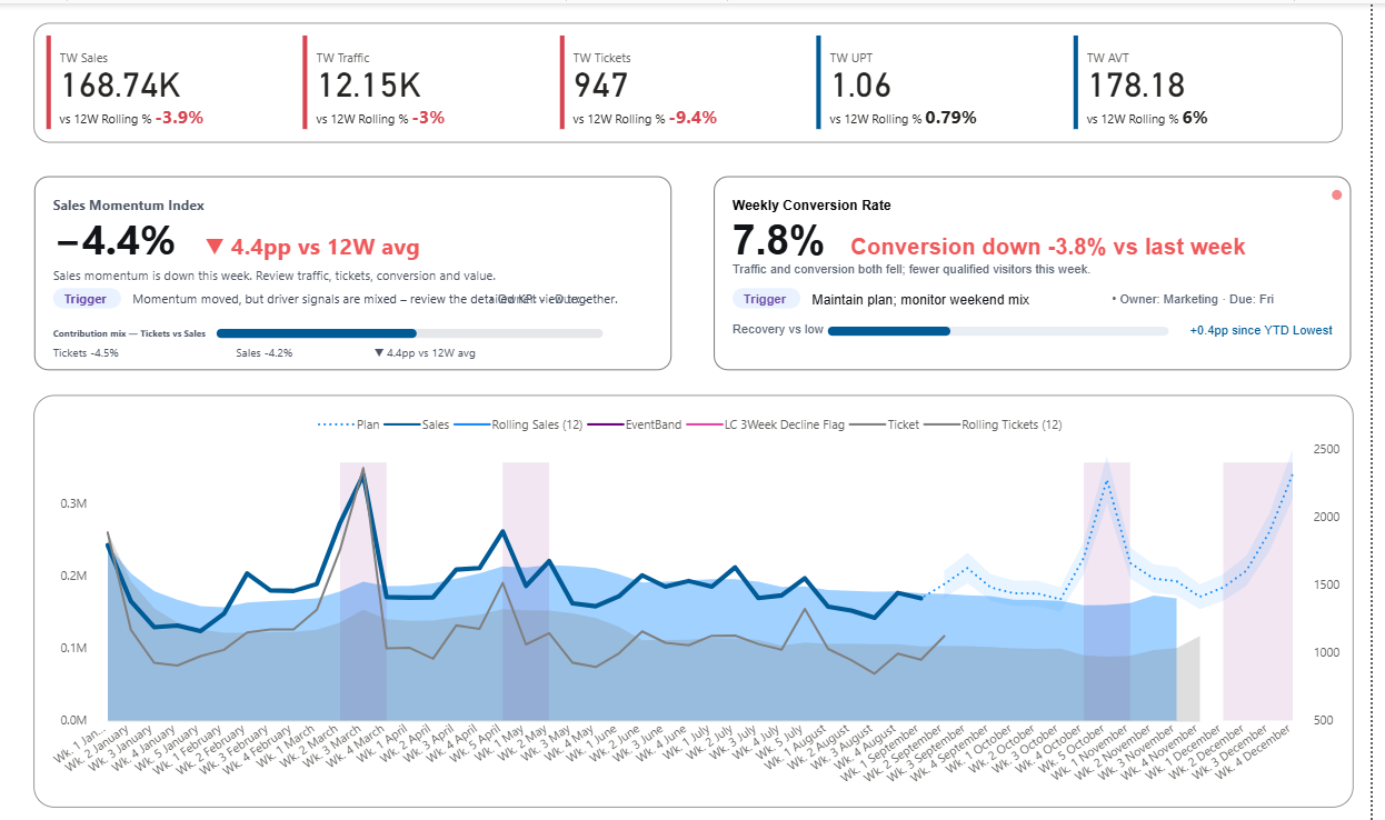
KPI CARD EXAMPLE
KPI cards that show signal, not just numbers
The first thing people look at in a dashboard is often the KPI card. When it only shows a number, the room still has to interpret what that number means. Better KPI cards reduce that hesitation.
WEEKLY REVIEW DASHBOARD
Weekly review dashboards that support structured discussion
Weekly dashboards work best when they keep teams from drifting into scattered commentary. They give everyone the same starting point, the same signal, and the same priority.
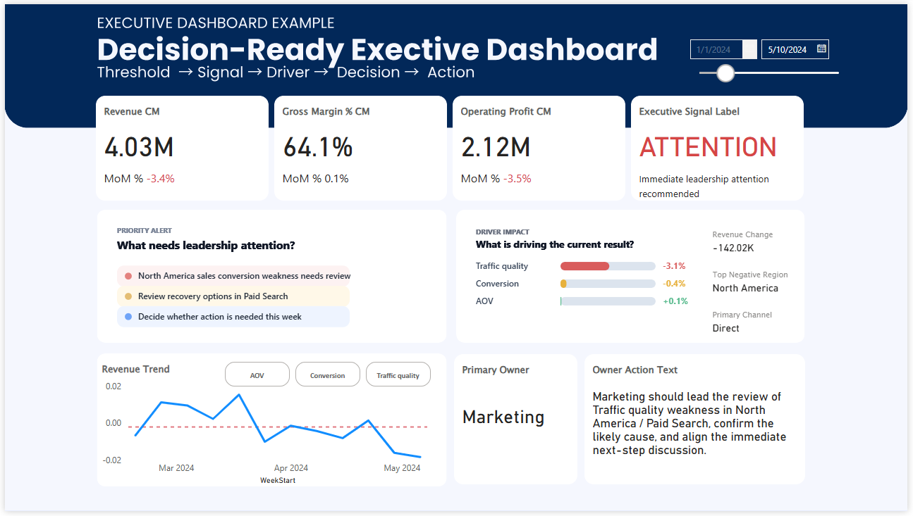
EXECUTIVE DASHBOARD EXAMPLE
Executive dashboards built for review and prioritization
Executive dashboards do not fail because they lack information. They fail when leaders still cannot tell what deserves attention first. Priority is what makes them useful.
What makes a dashboard effective for decision-making?
Many dashboards are built to answer one question: What happened? That matters, but it is usually not enough.
In a real meeting, people are trying to answer something more immediate: Where should we look first? Why is this moving? Do we need to act now?
That is the difference between a reporting dashboard and a decision-making dashboard. A useful dashboard does more than display KPIs and metrics. It helps people recognize the signal, understand the context, and begin the right discussion faster.
The examples below show how that works in practice across three common formats: KPI cards, weekly review dashboards, and executive dashboards.
EXAMPLE 1
KPI cards: the smallest unit of decision support
In many reviews, the KPI card gets the first glance. That means it often shapes the first thirty seconds of the conversation. If the card only shows a number, people still have to decide whether the result is healthy, risky, improving, or getting worse.
That small uncertainty matters more than it seems. Once the room starts debating what the number means, the discussion slows down. The issue is not that the data is missing. The issue is that the signal is weak.
A stronger KPI card makes the condition easier to read. It can show threshold status, comparison versus last week or last year, and a short narrative line that tells people why this number deserves attention now.
- Shows current condition more clearly
- Reduces hesitation at the start of a review
- Turns a metric into a signal people can react to
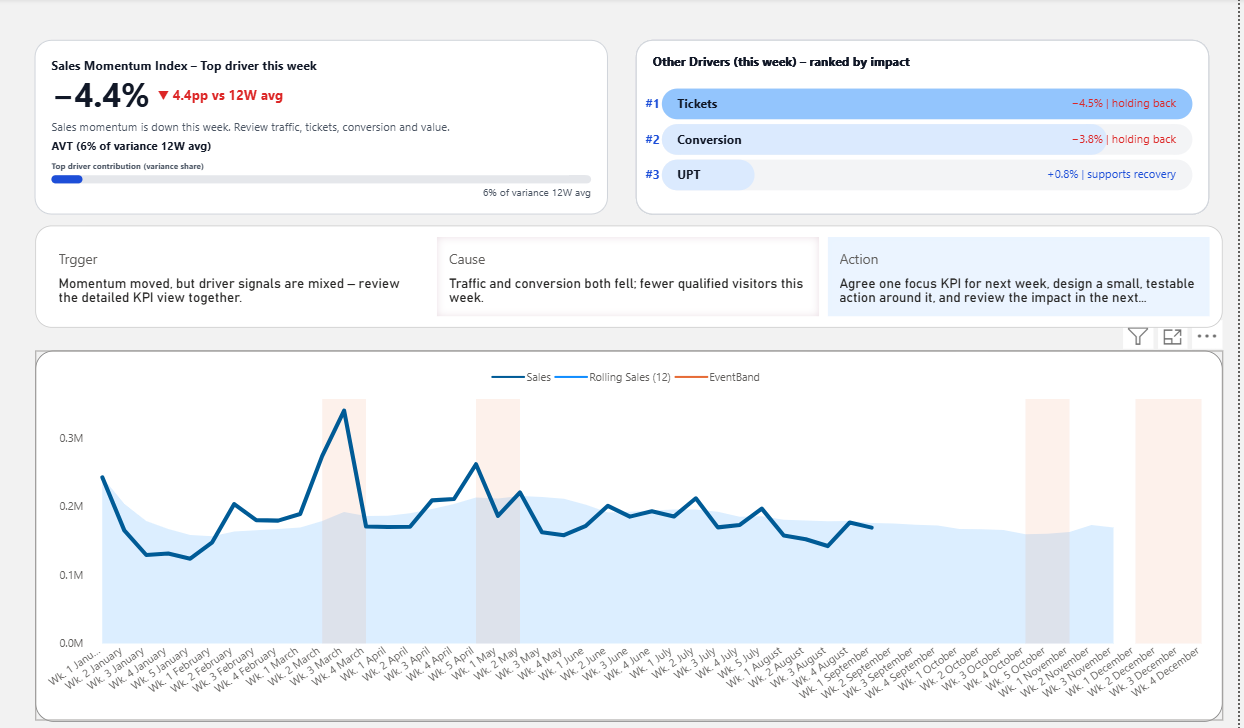
EXAMPLE 2
Weekly review dashboards: where metrics become aligned discussion
A weekly review dashboard plays a different role. It is not there just to summarize performance. It is there to keep the meeting from fragmenting.
Without structure, weekly reviews tend to drift. One person notices sales. Another notices margin. Another jumps to a channel issue. The dashboard is visible, but the team is no longer looking at the same problem.
A better weekly business review dashboard creates alignment before debate begins. It helps the team start from the same signal, connect that signal to likely drivers, and move more naturally toward the next decision or action.
- Creates a shared starting point for weekly reviews
- Helps connect KPI movement to likely causes
- Reduces meeting drift and scattered discussion
EXAMPLE 3
Executive dashboards: visibility is not enough without priority
Executive dashboards usually have the opposite problem. They often contain plenty of information. Revenue, trends, channels, regions, product groups, performance summaries. Everything is there.
But when a leader opens the screen, the real question is still simple: What needs my attention first?
That is why visibility alone is not enough. A useful executive dashboard helps leaders recognize priority quickly. It should make it easier to see where performance is breaking, what direction the trend is moving, and where the discussion should begin before time is lost in broad review.
- Useful for fast leadership reviews
- Reduces overload by clarifying priority
- Supports quicker judgment under time pressure
Decision-making dashboard examples all solve the same problem
These dashboards look different, but the job is similar. They help people move from observation to judgment with less friction.
That usually means three things have to become easier to see: what deserves attention, what changed, and where the next discussion should go. When those elements are missing, teams often respond with more digging, more explanation, and slower decisions.
Signal
What deserves attention right now?
Context
What changed, and what is likely behind it?
Direction
Where should the review or decision go next?
FAQ: Decision-Making Dashboards
What is a decision-making dashboard?
A decision-making dashboard is designed to help people decide what to focus on, not just understand what happened. It highlights signal, context, and priority so teams can move from insight to action faster.
How is a decision-making dashboard different from a regular dashboard?
A regular dashboard shows data, metrics, and KPIs. A decision-making dashboard goes further by making the condition, change, and urgency clear, so teams do not need to interpret the data before starting a discussion.
Why do dashboards fail to drive decisions?
Many dashboards present information but do not clarify what matters most. As a result, teams spend time interpreting numbers instead of deciding what to do next. The issue is not lack of data, but lack of clear signal and priority.
What are examples of decision-making dashboards?
Common examples include KPI dashboards that highlight performance signals, weekly review dashboards that align team discussions, and executive dashboards that help leaders prioritize where to focus first.
What should a good dashboard include for decision-making?
A strong dashboard should make three things clear: what needs attention (signal), what changed and why (context), and where to focus next (direction). These elements reduce hesitation and support faster decisions.
Do dashboards need to show more data to improve decision-making?
No. Adding more data often increases confusion. Effective dashboards reduce noise and bring forward the most important signals, making it easier to focus and decide quickly.
What is the difference between insight and decision in dashboards?
Insight explains what is happening in the data. Decision requires clarity on what matters and what to do next. Many dashboards provide insight, but fewer provide the structure needed to support action.
FINAL THOUGHT
Good dashboard examples do more than look polished
The most useful dashboards do not just help people observe the business. They help people recognize what matters, where to look first, and how to begin a better decision.