
Interactive Dashboard Example
Executive Dashboard Examples: Real Layouts for Business Reviews (With Interactive Demo)
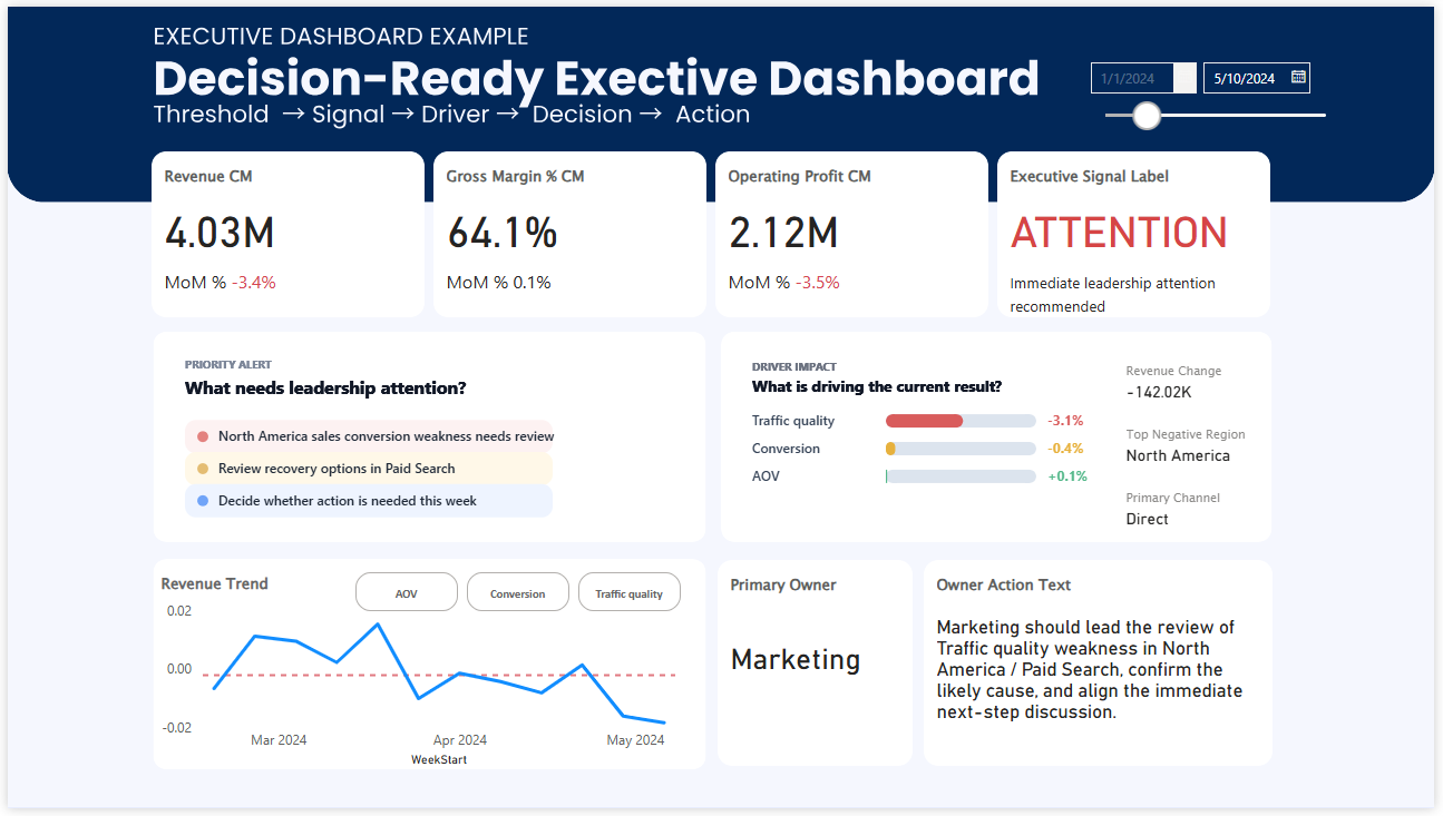
Most dashboards show data.
This one shows where attention should go next.
Explore a real executive dashboard used in business reviews. See how executives review performance, identify risk, and decide what matters next.
What this dashboard is showing
The structure is designed for quick judgment.
Instead of asking the viewer to interpret dozens of charts, it makes the current situation easier to understand at a glance. Signals, priorities, and direction appear before deep analysis begins.
Why this feels different from a typical dashboard
Many dashboards are built to display information.
A real executive dashboard needs to do more than that.
It needs to help leaders judge the situation quickly.
That is the difference between a dashboard that is visually polished and one that is genuinely useful in a leadership meeting.
When executives review performance, they are usually trying to answer questions like these:
- Are we on track or off track?
- Which KPI deserves attention first?
- Is this a temporary fluctuation or a meaningful signal?
- Where is the current risk?
- What needs to be discussed next?
If the dashboard does not help with those questions, it may still look impressive, but it is not really supporting decision-making.
Executives do not analyze dashboards the way analysts do
This is one of the biggest differences in executive dashboard design.
Analysts often explore. They compare segments, investigate drivers, and drill down into details.
Executives usually begin somewhere else.
They scan for signals. They look for what is off track, what is becoming risky, and where attention should go first.
That is why visual structure matters so much.
A dashboard that tries to show everything often slows judgment down. A dashboard that shows the right signals first can make the meeting sharper almost immediately.
A real dashboard example built for decision-making, not reporting
Many organizations already have data. Many already have reporting. Many already have dashboards.
But that does not automatically mean they are truly data-driven in the moment decisions are made.
Real decision-making starts when a dashboard does more than summarize performance.
It has to help people recognize:
- when something matters,
- how serious it is,
- where attention should go,
- and what conversation should happen next.
In other words, the dashboard should not just show numbers.
It should support judgment.
What makes this executive dashboard structure effective
A strong executive dashboard usually does not begin with chart quantity.
It begins with decision structure.
In practice, that often means:
- high-priority KPIs are visible first,
- variance vs target is immediately clear,
- trend direction can be recognized quickly,
- threshold or risk signals stand out,
- and the next discussion point becomes easier to identify.
This is why dashboards like this often feel calmer, cleaner, and more useful.
Not because they contain less information, but because they present information in the order decision-makers actually need it.
Typical dashboards explain performance. Executive dashboards direct attention.
That distinction matters.
A reporting dashboard often answers: What happened?
An executive dashboard should also help answer: What deserves attention now?
That is where many dashboards stop too early.
They provide visibility. But they do not provide enough decision orientation.
The result is familiar.
Teams can see the numbers, but meetings still drift into interpretation, extra analysis, and delayed action.
More Power BI dashboard examples
If you want to compare other dashboard structures, these examples explore different ways dashboards can become more decision-ready.
Together, these examples show an important shift: dashboards become much more powerful when they are designed not only to report performance, but to guide attention and support decisions.