
KPI Review Framework
KPI Review Framework: How to Structure Better Weekly Performance Reviews
Most KPI reviews include data, dashboards, and recurring meetings. But better review quality does not come from seeing more numbers. It comes from using a clearer structure for what to look at first, what explains movement, and what should happen next.
A strong KPI Review Framework helps teams move beyond reporting status. It gives structure to performance review so people can understand what changed, why it changed, what it means for the business, and what deserves action.
Without that framework, KPI reviews often become repetitive. Teams see many numbers but still struggle to align on priority, interpretation, and next-step direction.
Why KPI reviews often feel incomplete
Many KPI dashboards show results clearly, but the review still feels weak when the structure around those results is missing.
Too many metrics at once
Reviews become slower when important and less important metrics are presented with the same weight.
Weak driver visibility
Teams can see movement, but not the business drivers most likely to explain it.
Unclear action logic
Even when problems are visible, reviews still stall if there is no clear bridge from performance signal to next-step discussion.
The basic KPI Review Framework
A better KPI review usually follows four layers. This structure helps the meeting move from visibility to interpretation to action more naturally.
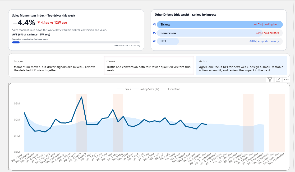
Signal
Start with the KPI signal that best reflects whether performance is healthy, weak, improving, or at risk.
Drivers
Surface the drivers most likely to explain the KPI movement so the team does not need to search everywhere at once.
Business Meaning
Connect the result to what it means for the business, not just what happened numerically.
Action Direction
Use the review to clarify what should happen next, who should respond, or what deserves follow-up.
What each KPI review layer contributes
Reviews usually become more useful when each layer plays a different role instead of forcing every chart to do everything.
Layer 1
Signal KPI
This is the metric that tells the team whether performance deserves attention now. It helps establish priority early in the meeting.
Layer 2
Driver KPI
These metrics explain what is contributing to the change. They reduce guesswork and narrow the conversation.
Layer 3
Business Interpretation
This layer connects the numbers to risk, opportunity, trade-offs, or operating reality so the team can discuss meaning instead of only metrics.
Layer 4
Action Logic
This is where the review becomes decision-ready. It makes the next move easier to define instead of leaving the meeting with vague conclusions.
Typical KPI review
- Reviews many numbers without strong priority
- Explains movement after the fact
- Depends heavily on presenter interpretation
- Often ends with more analysis
Framework-based KPI review
- Starts with the signal that matters most
- Brings likely drivers into the review earlier
- Clarifies business meaning more quickly
- Supports better next-step discussion
How dashboards fit this framework
A dashboard becomes more useful when it supports the review structure
A KPI dashboard does not need to answer every question. It needs to support the sequence of the review: what happened, what is likely driving it, what it means, and what action direction should follow.
- Clearer KPI focus
- Less meeting drift
- Better driver visibility
- Stronger bridge from reporting to action
Where this framework is most useful
This framework is especially useful for recurring business reviews where teams already have data, but still need a better way to align attention and discuss performance.
Weekly business reviews
Helps recurring review meetings become more structured and less repetitive.
Sales KPI reviews
Makes it easier to focus on commercial performance, likely drivers, and next-step trade-offs.
Management reporting
Improves how leaders interpret KPI signals before discussion expands into deeper analysis.
Next step
Use a Power BI template built around clearer KPI review logic
Explore the decision-ready Power BI template designed to improve KPI clarity, driver visibility, and the quality of recurring business review discussion.