
Executive Dashboard Use Case
Executive Dashboard: A Better Structure for Real Business Reviews
Executive dashboards often look polished on screen, yet still feel harder to use than expected in actual business reviews.
The issue is usually not the lack of data. It is that the dashboard does not make review, prioritization, and judgment as easy as leadership teams need under real meeting pressure.
KPIs may be visible. Trends may be present. Variance may already be calculated. And yet many executive meetings still begin with the same problem: people spend the first part of the discussion figuring out where to focus.
Why executive dashboards often feel harder to use than they look
Many dashboards are technically correct and visually complete, but that does not automatically make them effective in executive use. In leadership reviews, the challenge is not only seeing performance. It is deciding what deserves attention first.
That is where many executive dashboards still fall short. They support reporting, but not always prioritization. They show movement, but not always significance. They make information visible, but do not always make judgment easier.
A useful executive dashboard does not simply summarize performance. It helps a leadership team recognize what matters now, where to begin the discussion, and what deserves executive attention first.
What executives actually need in a dashboard review
Executives are rarely using dashboards the same way analysts do. They are not starting with deep exploration. They are usually scanning for priority, risk, and decision direction.
- Which KPI is most off track right now?
- Which movement is meaningful and which is only noise?
- Where should the discussion begin?
- What issue deserves executive attention now?
- Is there enough clarity to move toward action?
If a dashboard does not help with those questions, it may still look complete, but it will often feel slow in real use.
Common problems in real executive dashboard reviews
Too many KPIs compete at once
The dashboard contains useful information, but it is not obvious which number should lead the discussion.
Signal and noise are mixed together
A metric changes, but the dashboard does not make it clear whether the movement is minor variation or real business risk.
Meetings begin with alignment work
Several minutes are spent deciding where to start, because the review surface does not guide attention strongly enough.
Reporting is stronger than prioritization
The dashboard helps explain performance, but it does not fully support next-step discussion or leadership judgment.
What this looks like in practice
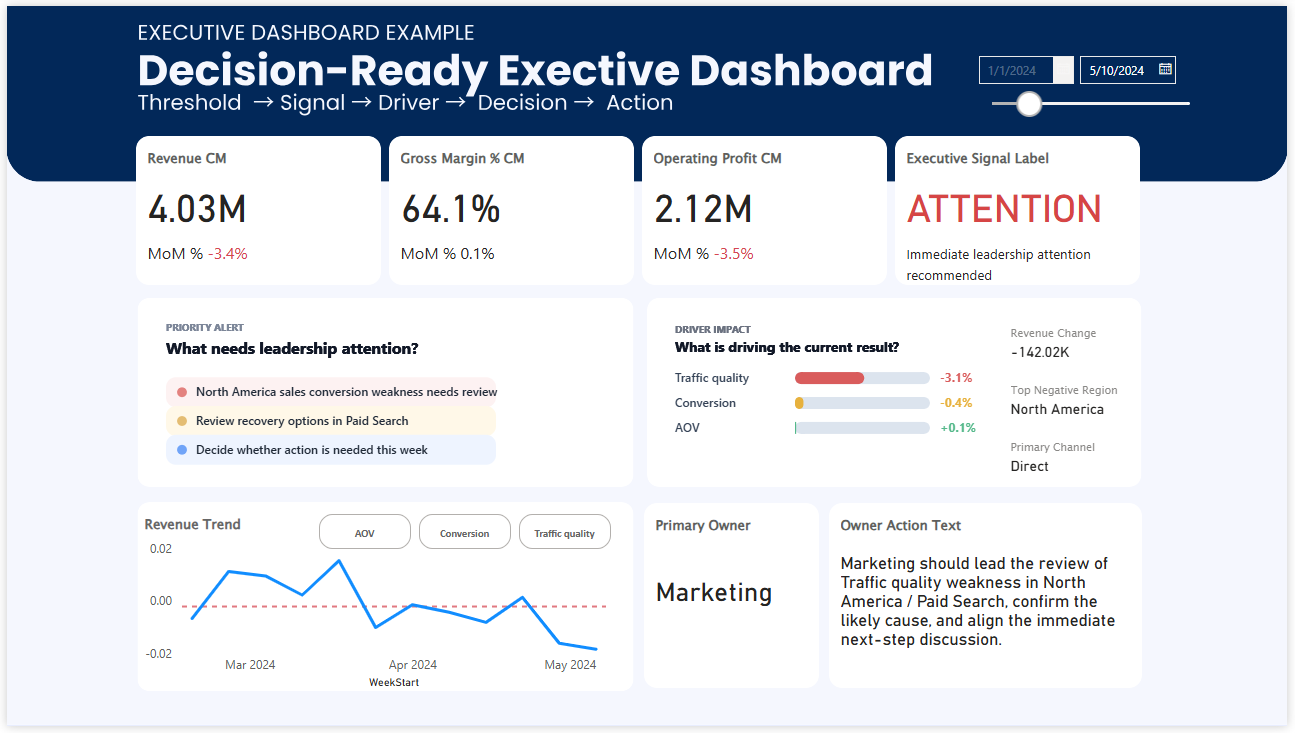
A more structured executive dashboard often feels different immediately. Not because it is more decorative, but because it makes business priority, signal, and review starting points easier to see.
This is one practical example of the kind of structure that supports executive review more effectively.
What a better executive dashboard structure does differently
More usable executive dashboards do not necessarily show less information. They organize information in the order decision-makers need it.
- High-priority KPIs appear first
- Variance versus target is immediately visible
- Trend direction is easy to recognize
- Threshold or signal logic helps distinguish real risk from routine movement
- Ownership or business focus is clear enough to support action discussion
In other words, the dashboard becomes easier to use not because it is visually simpler, but because it is structurally clearer.
From performance visibility to executive judgment
A traditional dashboard often answers one question well: What happened?
An executive dashboard needs to support a broader sequence:
Signal
What needs attention now?
Priority
What matters first in this review?
Discussion
Where should the conversation begin?
Action
What deserves executive response next?
This is where many dashboards stop too early. They provide visibility, but not enough decision orientation.
Why this matters even in data-driven organizations
Many organizations already have mature reporting environments. They track KPIs, monitor performance regularly, and review dashboards every week or month.
But data-driven maturity is not only about having visibility. It is also about whether the review surface helps people move from performance review to priority, and from priority to action.
That is why executive dashboard design matters more than it first appears. It shapes how quickly a leadership team can align, what they discuss first, and whether decisions become sharper or slower.
Related concepts behind executive dashboard design
Executive dashboards become easier to use when several supporting concepts are made clearer.
Explore related dashboard paths
If you want to compare how this logic appears in other dashboard structures, continue with these related pages.
See a practical Power BI example and how the structure supports review flow.
Power BI Dashboard ExamplesExplore broader dashboard examples across different review and decision situations.
Weekly Business ReviewSee how similar decision structure appears in recurring weekly performance meetings.