
Decision-Making Article
Actionable Insight Dashboard Example: Why Good Insights Still Don’t Lead to Action
I used to find actionable insights all the time.
The frustrating part was not finding them. It was watching them go nowhere.
A strong insight should create movement. But in many companies, even a clear next step gets pulled back into more questions, more analysis, and more discussion.
That gap between insight and action is exactly where many teams lose momentum.
A very simple example of an actionable insight
One example I often found looked like this:
Customers who bought Product A were 20% more likely to also buy Product B than other combinations.
This is what many people would call an actionable insight.
The next move seems obvious. Recommend Product B to customers who bought Product A.
The only real question should be how to execute it.
- Should the recommendation be sent by email?
- Should it appear on the website?
- Should store staff mention it at the next visit?
In other words, this is not the kind of idea that needs six more weeks of analysis. It is the kind of idea that should move quickly into a small, testable action.
But that is usually not what happens
When I shared insights like this, the response was rarely immediate action.
What usually came back were questions like these:
- Was that true for all customers or only a specific segment?
- What time period was used?
- Was there a promotion running during that period?
- Could seasonality explain it?
- Do we need to validate it one more way?
None of these questions are irrational. In fact, they often sound responsible.
But this is the point where many insights begin to stall. What looked actionable turns back into analysis.
Why people hesitate even when the next step looks obvious
Part of the reason is human.
People do not like moving forward when uncertainty still feels high. If a decision might be wrong, many teams would rather delay action than risk making the wrong move.
This is why insight alone is rarely enough.
The problem is not always that the analysis is weak. Often, the real issue is that the organization has no structure for turning a good signal into a safe, clear next action.
This is why the Gartner prediction felt so convincing
I had spent years working as an analyst, and yet I often felt that surprisingly few of the insights I produced actually improved business performance in a visible way.
I questioned everything: the quality of my analysis, the way I explained it, the way I framed the recommendation, even whether I personally was missing something.
Then I came across a widely cited Gartner prediction claiming that most analytics insights would fail to deliver business outcomes.
That did not feel discouraging. It felt clarifying.
It suggested that the problem was not just my analysis. It was a structural problem shared by many organizations.
Why actionable insights still do not become action
Once I looked at the problem this way, the pattern became much easier to see.
Good insights often fail for a few repeatable reasons:
- the insight is interesting, but not clearly prioritized,
- the likely business impact is not visible enough,
- the next action is not defined,
- ownership is unclear,
- and people do not feel safe acting under uncertainty.
That means the real gap is not between data and insight.
The real gap is between insight and decision.
A dashboard example designed to close that gap
That question led me to redesign the review experience itself.
Instead of giving teams only analysis, I wanted the dashboard to make the situation easier to judge and the next move easier to discuss.
The dashboard below is built around that idea.
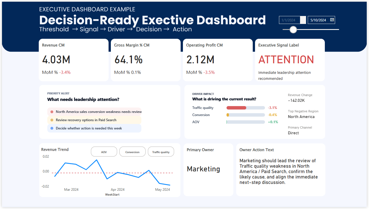
What this kind of dashboard changes
A better decision dashboard does not eliminate analysis.
It organizes the result of analysis so that teams do not have to rebuild the meaning from scratch every time they meet.
In practice, that means the dashboard helps make these things visible:
- what is off track,
- why it likely matters,
- how serious it is,
- where attention should go first,
- and what actions should be considered next.
Once that structure is in place, the team is much closer to action.
The meeting no longer starts from “What are we looking at?” It starts much closer to “What should we do?”
That is why Decision OS became necessary
The insight was never the end point.
The real challenge was always what happened after the insight appeared.
If organizations already have reports, dashboards, and analysts, but still struggle to turn signals into action, then the missing layer is not more reporting.
It is decision structure.
That is the reason I began thinking about Decision OS: not as another analytics concept, but as a way to make good insights more likely to become aligned action.
Free Paper
Why do good insights still fail before action begins?
Read the free paper to see why insight alone is rarely enough, and what structure teams need after analysis.
Read the Free PaperMore Dashboard Examples
See how decision-ready dashboards are designed
Explore executive and KPI dashboard examples built to guide attention, reduce ambiguity, and support faster decisions.
See Dashboard Examples