
Decision Interface
Data Visualization for Decision Making: How Dashboards Help Teams Decide
Data-driven dashboards should do more than visualize KPIs. Learn how better dashboard structure helps teams focus attention, reduce uncertainty, and make clearer business decisions.
Dashboards are incredibly useful. They make trends easier to recognize, reduce reporting friction, and help teams understand business performance faster than ever before.
But even when a dashboard is clean, interactive, and professionally designed, an important problem often remains: people still interpret the same data differently.
Some viewers recognize a signal immediately. Others see normal fluctuation. Some understand the business impact instinctively. Others need far more context before they feel confident enough to act.
This is where data visualization for decision making becomes different from ordinary reporting. The goal is not only to make data easier to see. The goal is to make the business meaning easier to judge.
When a dashboard shows the data, but the decision still does not happen
I experienced this directly while working with customer and sales data inside business review environments.
In one situation, I noticed subtle changes in customer behavior that suggested future sales momentum was beginning to weaken. The shift itself was not dramatic enough to dominate a normal dashboard. It was not the kind of red flag that instantly forces everyone to stop and react.
But after spending enough time inside the data, the pattern felt important. It suggested that a specific customer segment needed more attention and that marketing activity might need to be adjusted before the slowdown became obvious in the main sales numbers.
I brought the analysis to management and explained why I believed the signal mattered. More detail was requested. I prepared deeper breakdowns, additional evidence, and more context to show the potential impact.
The recommendation was still not fully accepted.
Looking back, the issue was not that the dashboard was wrong. The issue was that the potential impact was not immediately visible enough for the organization to align around a decision.
That experience changed how I think about dashboards. A dashboard can be accurate and still fail to create action. It can be clear and still fail to communicate urgency. It can visualize the right data and still leave people uncertain about what should happen next.
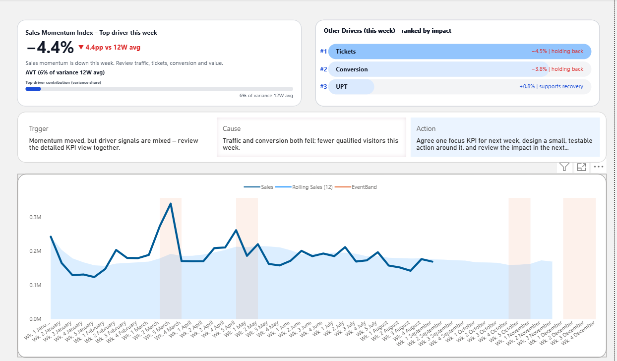
A decision-ready dashboard does not stop at showing metrics. It helps teams move from signal to cause to action.
Why data visualization alone is not enough for decision making
Traditional data visualization focuses on clarity, comparison, pattern recognition, and storytelling. These are all valuable. A confusing chart slows understanding, and a poorly designed dashboard makes every business review harder.
But clarity is not the same as decision readiness.
A clear chart may show that sales are slowing. It may show that conversion is declining. It may show that one customer segment is weakening. But the dashboard may still leave the team with several unanswered questions.
- Is this change serious enough to act on?
- Is this a temporary fluctuation or an early warning?
- Which driver matters most?
- What action should be discussed first?
- Who needs to make the decision?
When those questions are not answered, the meeting often returns to more analysis. The dashboard has made the data visible, but it has not yet made the decision easier.
The real problem: people do not read signals the same way
One reason dashboards fail to support decisions is that viewers do not bring the same context to the data.
An analyst may see a small variance and recognize the beginning of a larger pattern. A manager may see the same number and think it is too small to worry about. A sales leader may focus on the short-term impact, while a finance leader may focus on margin exposure. None of these interpretations are necessarily wrong.
The problem is that the dashboard has not provided enough structure to help people interpret the signal in the same way.
This is why better dashboard design is not only about visual hierarchy or chart selection. It is also about decision hierarchy. The dashboard needs to help the team understand which signals deserve attention, how much they matter, and what kind of response should follow.
From dashboards as reports to dashboards as decision interfaces
A report explains what happened. A dashboard organizes what is happening. A decision interface helps a team understand what should happen next.
That shift changes the design question.
Instead of asking, “How can we show this data clearly?”, the better question becomes: “What does the team need to see in order to make a better decision?”
In practice, that usually means the dashboard should guide attention through a structure like this:
This structure does not remove human judgment. It protects judgment from being wasted on the same basic interpretation questions every week.
What a decision-making dashboard should make easier
A dashboard designed for decision making should not simply add more charts. It should reduce the distance between seeing the data and understanding what to do with it.
1. Focus attention
The dashboard should make it clear which KPI or signal deserves attention first, instead of asking users to scan everything equally.
2. Show thresholds
It should help people understand when a change is normal, when it is concerning, and when it requires action.
3. Explain drivers
It should connect outcomes to the factors most likely causing them, so the discussion does not restart from zero.
4. Make impact visible
It should help the team see why the signal matters before the cost becomes obvious in the final result.
5. Guide the next conversation
It should help teams move toward the next decision, not simply admire or debate the data.
6. Preserve judgment
It should support human decision-making without pretending every business situation can be automated.
Why this matters for data-driven decision making
Many organizations already have dashboards. They already track KPIs. They already run weekly reviews and performance meetings. The issue is not always a lack of data.
The deeper issue is that dashboards often stop at visibility.
Visibility helps people understand what happened. But decision making requires something more: shared context, signal strength, business impact, and action direction.
Without that structure, even good dashboards can lead to familiar outcomes. The team sees the issue, discusses the issue, asks for more analysis, and then waits until the signal becomes too large to ignore.
That delay is where business opportunity is often lost.
The next layer: decision-ready dashboards
This is where Decision Dashboards become important. They go beyond visibility and add structure for prioritization, interpretation, and action.
At a broader level, this leads to Decision OS: a way of designing dashboards and review systems so that signals turn into aligned decisions instead of vague discussion.
The point is not to make dashboards more complicated. It is to make decisions less dependent on individual interpretation. A good dashboard should help more people see the same risk, understand the same impact, and begin the conversation from the same decision point.
Good dashboards help people see. Better dashboards help people decide.
Data visualization for decision making is not only about beautiful charts or clean layouts. Those things matter, but they are not enough.
The real test is whether the dashboard helps people focus attention, understand the signal, recognize the impact, and decide what should happen next.
A dashboard that only makes data visible may still leave the organization uncertain. A decision-ready dashboard reduces that uncertainty and helps teams move from visibility to action.