
Executive Dashboard Examples
Executive Dashboard Examples: What Actually Works in Business Reviews
If you are looking for executive dashboard examples, you probably do not need another definition of what an executive dashboard is. You need to see what a good one actually looks like.
Most teams already have the KPIs. Revenue, margin, sales, pipeline, customer activity, operational performance, or whichever measures leadership expects to review. The harder question is how to organize those KPIs so executives can quickly understand what matters.
An executive dashboard has to be treated more carefully than a daily analysis report. It is used in a room where attention is limited, questions come quickly, and the cost of confusion is high. A dashboard may contain the right numbers and still fail if it does not make priority clear.
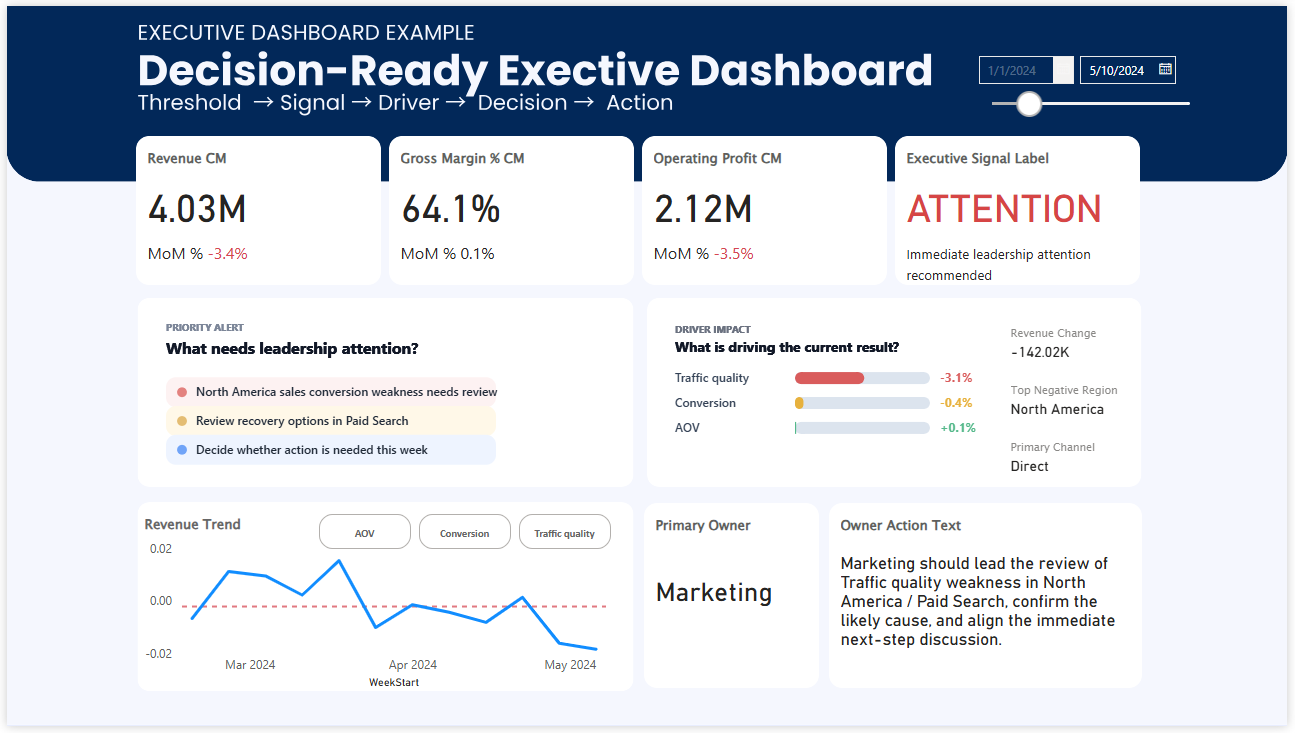
Executive Dashboard Example
This is the kind of example many people are looking for first: a real dashboard image that can be evaluated quickly. Before discussing frameworks or design principles, it helps to see the actual layout.
Why executive dashboard design is hard when you already have many KPIs
The problem usually does not start with a blank page. It starts with too many reasonable things to include. Every KPI has a reason. Every department has a metric. Every leader has a question they want answered. None of those requests are wrong, but together they can make the dashboard difficult to use.
This is why executive dashboards often become crowded. Teams try to be safe by including everything important. But when everything is included with the same weight, leadership has to do the prioritization in the meeting. The dashboard reports performance, but it does not yet guide the review.
A better executive dashboard does not simply add all available KPIs. It creates a hierarchy. It shows which numbers define the current business condition, which movements need attention, and which areas deserve discussion first.
The question is not only, “Which KPIs should we include?” The stronger question is, “Which KPIs should shape the conversation first?”
What actually works in an executive business review dashboard
A dashboard that works for executives is not necessarily the dashboard with the most detail. It is the one that helps leaders understand the situation quickly enough to have a useful conversation.
- The most important KPIs are visible before supporting details compete for attention.
- Performance movement is shown against a meaningful comparison, such as target, baseline, or prior period.
- Signals help separate routine fluctuation from issues that deserve review.
- Drivers are grouped or ranked so leaders can see what may be influencing the result.
- The layout gives the meeting a clear starting point instead of making everyone scan the page.
This is where ranking can be especially useful. If you have many KPIs or many drivers, ranking helps turn a long list of information into a clearer order of attention. Leaders do not need every detail at the same time. They need to know what deserves the first discussion.
What executives actually need to see first
Executives rarely use dashboards the way analysts do. They are not usually opening the dashboard to explore every path in detail. They are looking for a fast reading of business condition, priority, risk, and direction.
- Is the business on track or off track?
- Which KPI changed enough to matter?
- Which issue deserves attention before everything else?
- What driver is most likely influencing the result?
- Where should the review conversation begin?
If the dashboard does not help answer these questions, it may still look complete, but it will feel slow in the room. People will spend the first part of the meeting orienting themselves instead of discussing the decision that needs attention.
Common problems in executive dashboard examples
Too many KPIs compete at once
The dashboard contains important numbers, but it is not obvious which one should lead the review.
Everything looks equally important
When all cards, charts, and sections carry the same weight, executives have to create priority themselves.
Signals are not clear enough
A metric moves, but the dashboard does not show whether the movement is normal, concerning, or urgent.
The review starts too slowly
The first few minutes are spent deciding where to look, because the dashboard does not guide attention strongly enough.
How to organize KPIs for executive dashboards
When you already have many KPIs, the goal is not to fit them all into the first screen. The goal is to create a structure that makes the business easier to read.
One useful approach is to separate KPIs into three layers. The first layer shows the outcome leaders care about most. The second layer shows the drivers that explain movement. The third layer provides supporting detail for follow-up questions.
Outcome
What result defines whether the business is healthy?
Signal
Which KPI needs executive attention now?
Driver
What is most likely influencing the result?
Action
Where should the review conversation move next?
This structure helps prevent the dashboard from becoming a collection of disconnected KPIs. It turns the page into a review path.
Why ranking important KPIs can make the dashboard clearer
In executive reviews, ranking is useful because it makes priority visible. If all KPIs are displayed as equal cards, the viewer has to scan everything and decide what matters. A ranking view can immediately show which area is contributing most to the current issue or which driver deserves attention first.
This does not mean the dashboard should oversimplify the business. It means the dashboard should help leaders enter the discussion at the right level. Details can still exist, but they should not compete with the signal.
A strong executive dashboard does not hide complexity. It organizes complexity so leaders can see where judgment is needed.
From executive reporting to executive decision support
Many executive dashboards are called decision dashboards, but in practice they remain reporting surfaces. They show what happened, but they do not always make the next conversation easier.
A better executive dashboard supports the movement from visibility to judgment. It shows the current condition, identifies what deserves attention, connects the issue to possible drivers, and gives the business review a clearer starting point.
That is the difference between a dashboard that looks complete and a dashboard that actually works in a leadership meeting.
Related dashboard paths
If you want to compare this structure with other dashboard examples, these pages may help.
See the full Power BI example and how the layout supports executive review flow.
Power BI Dashboard ExamplesExplore broader dashboard examples across performance review and decision situations.
Weekly Business Review DashboardSee how review structure changes recurring business meetings.
Decision DashboardLearn the broader logic behind dashboards designed to support attention and prioritization.