
Weekly Meeting Dashboard Guide
Weekly Business Review Dashboard: A Better Power BI Structure for Weekly Meetings
Most weekly review meetings do not fail because teams lack data. They stall because reporting does not make priority, business context, and next-step discussion clear enough. This dashboard structure was designed to improve that moment.
A real Weekly Business Review dashboard example
When people search for a weekly business review dashboard, they usually want to see the actual reporting structure first. Not just the theory. The real layout. The screen that supports the meeting.
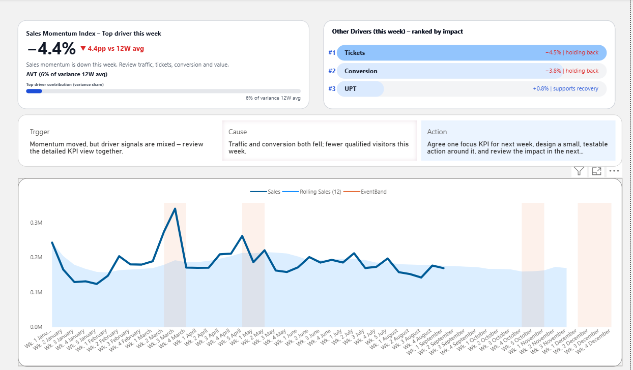
This example shows a weekly dashboard designed to do more than summarize results.
It helps teams quickly see KPI condition, surface likely drivers, and move into a more useful business discussion with less repetitive explanation.
What this dashboard example helps reveal:
- which KPI needs attention first
- what changed versus the recent pattern
- which likely driver deserves discussion next
- how the review can move faster from reporting to action
A Weekly Business Review Dashboard should do more than summarize what happened. It should help people review performance faster, understand what changed, identify likely drivers, and move toward a more useful business conversation.
When reporting structure is weak, weekly meetings often become repetitive. Teams spend too much time explaining numbers, re-reading charts, and debating where attention should go first.
Interactive Weekly Business Review dashboard preview
Explore the live Power BI preview to see how KPI signals, driver visibility, and weekly review structure work together in a real dashboard.
This preview shows the interactive review structure. The template path provides the editable Power BI file and a cleaner starting point for weekly reporting and review.
Why weekly business review meetings often lose momentum
Many review meetings include dashboards, KPIs, and updates. But that does not automatically create a good review structure. The meeting still slows down when people cannot quickly see what matters first.
Too much explanation
Teams spend too long interpreting results because the dashboard does not make KPI condition obvious enough.
Weak priority
Important metrics and less important metrics often sit side by side, making it harder to focus attention early.
Unclear next-step discussion
Meetings drift when reporting does not naturally support cause, business implication, and action-oriented review.
What a better weekly review dashboard structure looks like
A useful weekly business review dashboard should reduce ambiguity before discussion expands. It should help people understand performance condition, likely drivers, and what deserves attention next.
Typical weekly review dashboard
- Many charts compete for attention
- KPI status is not immediately obvious
- Interpretation happens in the meeting
- Business context depends on the presenter
- Action discussion starts too late
Decision-ready weekly review dashboard
- Shows what deserves attention first
- Makes KPI condition easier to interpret
- Brings likely drivers into the review earlier
- Improves reporting clarity before discussion grows
- Supports stronger next-step alignment
How this structure helps
Designed for what happens after the dashboard opens
This dashboard structure is useful when the meeting needs to do more than observe numbers. It helps people quickly see KPI condition, review what changed, surface likely drivers, and guide the next business conversation more clearly.
- Clearer KPI condition at the start of the review
- Better visibility into likely business drivers
- Less time lost in repetitive explanation
- Stronger bridge from reporting to action discussion
What this dashboard helps improve
Weekly review quality is shaped by dashboard structure more than most teams realize. A better structure improves not only what people see, but how the meeting works.
Improve reporting clarity
Make weekly performance easier to read, easier to explain, and less dependent on verbal interpretation.
Improve meeting focus
Reduce time spent deciding where attention should go and help the discussion start from stronger priority.
Improve next-step alignment
Help teams connect performance review with clearer action discussion instead of stopping at observation.
FAQ about Weekly Business Review dashboards
What is a Weekly Business Review dashboard?
A Weekly Business Review dashboard is a reporting structure used to support weekly KPI review meetings. It helps teams quickly understand performance condition, likely drivers, and where business discussion should begin.
What should a Weekly Business Review dashboard include?
A strong Weekly Business Review dashboard usually includes KPI signals, trend visibility, driver context, and a structure that helps the meeting move toward interpretation and next-step discussion.
Why do weekly review meetings lose momentum?
Weekly review meetings often slow down when dashboards show too many competing metrics, do not make KPI condition clear enough, or leave interpretation entirely to the presenter during the meeting.
Next step
Bring a better weekly review structure into your dashboard
Explore the decision-ready Power BI template designed to improve KPI clarity, driver visibility, and the quality of weekly business review discussion.