
Have you ever used a heatmap in Dashboards—or seen one and thought, “Wait, how does this work again?” If so, you’re not alone. Even though heatmaps are widely recognized for their visual impact, they’re often misunderstood or underutilized
In this blog, I’d like to walk you through how heatmaps can be used effectively—not only to track changes over time, but also to compare KPIs across anything like product categories, employee talents, competitors et… We’ll also take a closer look at something surprisingly powerful: color.
🔹 What Is a Heatmap?
According to Wikipedia:
“A heat map (or heatmap) is a 2-dimensional data visualization technique that represents the magnitude of individual values within a dataset as a color. The variation in color may be by hue or intensity.”
In simple terms, a heatmap uses color to show where numbers are higher or lower—usually with deeper colors representing higher values, and lighter ones for lower.
🔹 When Should You Use a Heatmap?
I used to work as a data analyst, and ironically, I didn’t use heatmaps all that often. That changed one day when I was browsing S&P 500 sector data and saw a beautifully structured heatmap that made performance differences across companies visually obvious. It was a lightbulb moment.
Common use cases include:
-
Visualizing sales fluctuations across time (e.g. daily, monthly)
-
Showing positive/negative trends
-
Comparing performance by day of week or season
These are typically time-based applications—but let’s expand that.
🔹 A Powerful Yet Underused Scenario: Comparing KPIs
Heatmaps are incredibly useful for comparing KPIs across dimensions like:
-
Different stores or branches
-
Sales reps or departments
-
Products or customer groups
-
Job candidates or employee metrics
Take a look at this example:
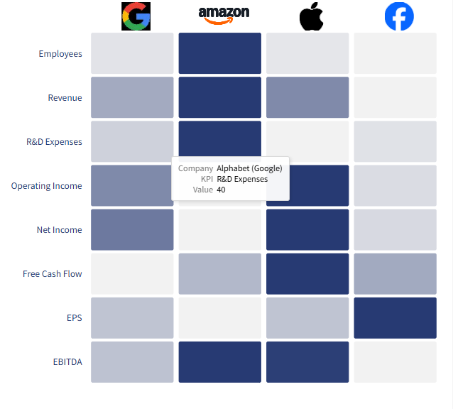 Start Custom Your Heatmap
We’re comparing multiple companies (GAFA) across a range of financial KPIs.
Because each row represents the same KPI and color is consistent across the grid, it’s easy to spot who’s strong in what. The use of a single color scale helps users focus on intensity rather than decode new colors.
🔹 But What Happens If You Use Too Many Colors?
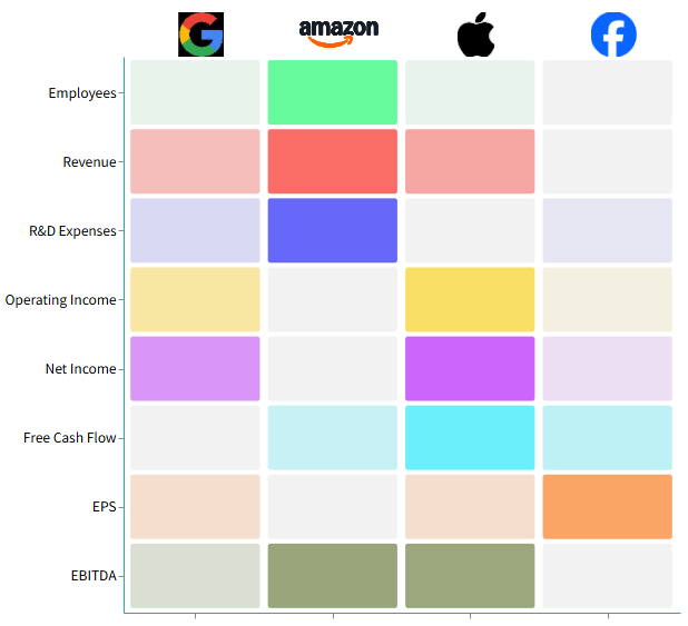 Start Custom Your Heatmap
Here, we applied different color palettes to each KPI. It may look “more colorful”, but the meaning gets lost quickly. The brain can’t immediately distinguish what dark green in Revenue means versus dark blue in R&D Expenses. The message becomes diluted.
This is especially problematic when color is used to group categories visually, but the gradation gets overshadowed by conflicting hues.
🔹 When Multi-Color Makes Sense
 🖼️ Screenshot 3:
In some cases, like evaluating different criteria for example in this case, properties or assets, there may be too many IDs to use a single scale meaningfully. Here, grouping KPIs with shared color schemes (e.g. purples for age, greens for location, reds for value) makes sense.
When datasets grow wide, grouped color coding by category can help viewers stay oriented.
But even then, use caution:
-
Avoid too many hues that compete for attention
-
Use consistent gradients within each group
-
Clearly label or divide sections to guide the eye
🔹 So What’s the Key Takeaway?
In heatmaps, color isn’t decoration—it’s communication.
Keep it clear. Keep it intentional. Whether you’re showing time series or cross-sectional KPIs, thoughtful color design can turn your heatmap from confusing into compelling.
🔹 Tips for Better Heatmaps in Power BI:
-
Stick to one color scale for simple KPI comparisons
-
Group colors only when dimensions are wide and semantically distinct
-
Add tooltips or labels when color alone can’t explain context
-
Test with grayscale to ensure clarity for colorblind users
-
Use white or muted backgrounds to enhance contrast
🔹 Final Thoughts
Heatmaps are more than eye candy—they’re insight machines when used right.
Whether you’re showing performance shifts over time or benchmarking teams across metrics, don’t underestimate how much color clarity impacts comprehension.
If you’re experimenting with heatmaps in Power BI or want to see how we’ve built editable heatmap visuals for anyone to try—check out our interactive gallery.
Let me know if you’ve used heatmaps in a creative way!
🔗 Optional Reference Link (S&P Heatmap)
You can insert:
FINVIZ Heatmap (S&P 500)