May 28, 2025 | Custom Visuals
Have you ever used a heatmap in Dashboards—or seen one and thought, “Wait, how does this work again?” If so, you’re not alone. Even though heatmaps are widely recognized for their visual impact, they’re often misunderstood or underutilized In this blog, I’d like to...

May 23, 2025 | Pie Chart, Uncategorized
Same visuals, but one looks way nicer… With just a slight visual tweak—like adding separators to a donut chart—your entire dashboard can shift from “functional” to “polished.” It’s not about data accuracy; it’s about...
May 18, 2025 | Custom Visuals, Gradient
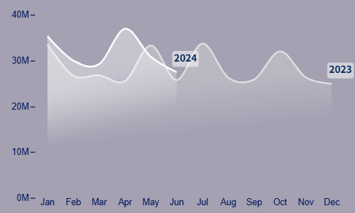
Gradient Line Chart for Power BI – No Code, Just Design If you’ve ever tried to create your dream visual in Power BI, you probably know the feeling: you research endlessly, test plug-ins, explore YouTube tutorials… and yet, the result never quite matches the...
May 18, 2025 | Custom Visuals, Gradient
Why Gradient Charts Matter in Dashboards In modern dashboard design, how data looks is almost as important as what it shows. Gradient charts help strike that balance – they’re elegant, informative, and subtly powerful. But their benefits go beyond just looks. The...
