
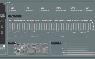
Power BI Sales Dashboard Template (Decision-Ready Design)
You See the Urgency in the Data — but the Room Stays Calm.

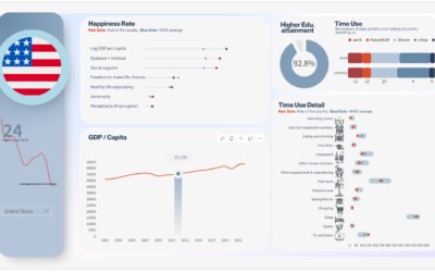
One Metric to Replace Dozens of KPIs
From Criticism to Motivation: How Dashboards Can Truly Move People
Have you ever built a dashboard that you felt was insightful and valuable, only to realize that the people you shared it with didn’t act on it?This is a common frustration. A dashboard might be packed with data, but if it feels like criticism — “20% below plan,” “high...
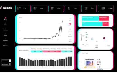
TikTok Dashboard Template for Power BI – Track Engagement Like a Pro

Stop Copy-Pasting: Connect Excel or Power BI to PowerPoint
How to Build a Visually Intelligent Dashboard in Power BI
📊 How to Build a Visually Intelligent Dashboard in Power BI “80% of external information is said to be acquired visually.”Yet many dashboards fail to guide that visual attention properly.In this article, I’ll walk you through the principles I used to design a Power BI...
Create Heatmap in Power BI?
Have you ever used a heatmap in Dashboards—or seen one and thought, “Wait, how does this work again?” If so, you’re not alone. Even though heatmaps are widely recognized for their visual impact, they’re often misunderstood or underutilized In this blog, I’d like to...

Bar Chart with Images in Power BI
🚫 Why You Still Can’t Add Images to Power BI Bar Charts—And What You Can Do About It While Power BI has made tremendous progress in visual analytics, adding images directly into bar charts is still not officially supported in native visuals. That means if you're...

One Small Design Change That Makes Your Power BI Dashboards Look Professional
Same visuals, but one looks way nicer...With just a slight visual tweak—like adding separators to a donut chart—your entire dashboard can shift from "functional" to "polished." It's not about data accuracy; it's about presentation. And when the presentation is sharp,...