
Jun 25, 2025 | Uncategorized
Are you tired of manually updating charts in PowerPoint every week or month?If you regularly create reports or presentations using the same format, there’s a smarter way: embed Power BI visuals directly into PowerPoint. It keeps your presentations live, interactive,...

Jun 19, 2025 | PowerBI Template
📊 How to Build a Visually Intelligent Dashboard in Power BI “80% of external information is said to be acquired visually.”Yet many dashboards fail to guide that visual attention properly.In this article, I’ll walk you through the principles I used to design a Power BI...
May 28, 2025 | Custom Visuals
Have you ever used a heatmap in Dashboards—or seen one and thought, “Wait, how does this work again?” If so, you’re not alone. Even though heatmaps are widely recognized for their visual impact, they’re often misunderstood or underutilized In this blog, I’d like to...
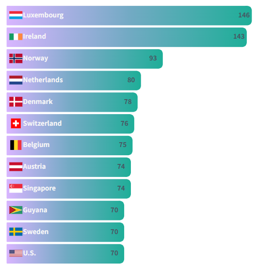
May 26, 2025 | PowerBI Template
🚫 Why You Still Can’t Add Images to Power BI Bar Charts—And What You Can Do About It While Power BI has made tremendous progress in visual analytics, adding images directly into bar charts is still not officially supported in native visuals. That means if you’re...

May 23, 2025 | Pie Chart, Uncategorized
Same visuals, but one looks way nicer… With just a slight visual tweak—like adding separators to a donut chart—your entire dashboard can shift from “functional” to “polished.” It’s not about data accuracy; it’s about...
