
Dashboard Design
Beautiful Dashboards Don’t Always Help People Decide
A dashboard can look excellent and still fail in the most important moment: the moment when people need to decide.
Good dashboard design matters. Clean layout, hierarchy, spacing, and readability all improve usability.
But a dashboard is not successful just because it looks polished. It is successful when it helps people move from data to decision with less friction.
Why decisions still don’t happen
A good dashboard often does exactly what it is designed to do. It makes the data easier to understand. It highlights changes. It helps people notice patterns and generate insights.
And in that sense, it works.
But something different often happens in real meetings.
Once an insight appears, the conversation does not move directly to a decision. Instead, it expands.
“What is driving this?”
“How does this look by segment?”
“What happened last week?”
“Can we break this down further?”
More filters are applied. More slices are explored. More analysis begins.
The dashboard becomes a tool for exploration. And the discussion shifts from deciding to investigating.
That is not necessarily wrong. But it comes with a cost.
Decisions become slower. Focus becomes fragmented. And the meeting often ends with more questions than answers, pushing the real decision to the next discussion.
This is why even well-designed dashboards can still struggle to improve business outcomes.
The problem is not that dashboards fail to show data. The problem is that they often fail to shape decisions.
Visual quality is only the beginning
Many dashboards are optimized for presentation. Fewer are optimized for business judgment.
In real meetings, the challenge is not simply understanding the chart. It is determining what deserves attention, who owns the issue, and what kind of response should follow.
A dashboard becomes more useful when it gives structure to attention, interpretation, and action.
What better dashboards do differently
Better dashboards do not only show results. They help teams organize judgment.
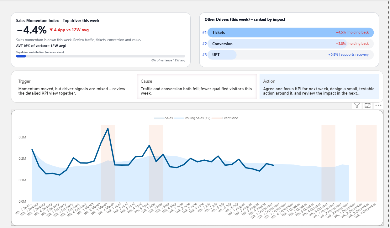
- They make the most important signal easier to spot
- They connect metrics to likely drivers
- They frame the next discussion or action
That is what starts to move a dashboard beyond aesthetics and toward decision support.
Related reading
Continue with The Gap Between Insight and Decision, or visit Data Visualization for Decision Making.