
Decision-Making / Dashboard Strategy
Decision-Driven Dashboard Examples: How to Design Dashboards That Support Decisions
A decision-driven dashboard is designed to help teams focus on what matters, recognize meaningful change, and decide what to do next. It does not only show KPIs. It adds structure around those KPIs so people can understand which signals need attention, what may be driving them, and what kind of follow-up should happen.
What is a decision-driven dashboard?
A decision-driven dashboard is a dashboard built to support business decisions, not just reporting. It highlights important KPIs, shows when performance crosses meaningful thresholds, connects results to likely drivers, and helps teams decide where to focus first.
Decision-driven dashboard examples
A decision-driven dashboard can take many forms, but the best examples usually share one thing: they make the next business discussion easier. Instead of asking people to interpret every chart from scratch, the dashboard already points attention toward the most important signals.
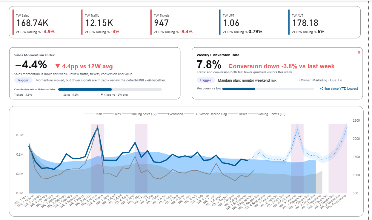
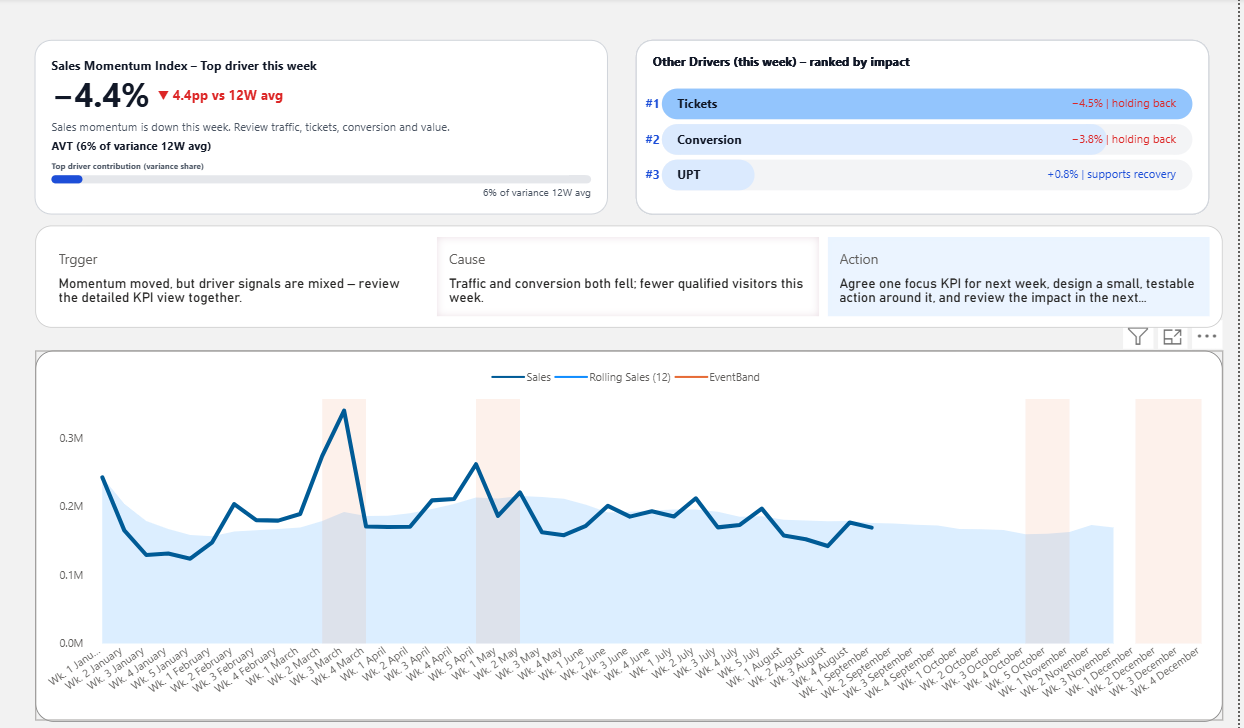
Sales dashboard
Shows revenue, conversion rate, average order value, and customer activity, then highlights which driver is most responsible for performance change.
Executive dashboard
Summarizes business health, risk signals, and priority areas so leaders can quickly see where attention is needed.
Weekly business review dashboard
Organizes KPIs around the meeting agenda and shows what changed, why it changed, and what should be discussed next.
How to build a decision-driven dashboard
To design a dashboard that supports decisions, start with the decision process first. The goal is not to add more charts. The goal is to make the most important review questions easier to answer.
Define the decision
Clarify what kind of business decision the dashboard should support.
Choose the key KPIs
Select only the KPIs that matter for that decision, not every metric available.
Add thresholds and signals
Define when a KPI change becomes meaningful enough to require attention.
Connect KPIs to drivers
Show what may be causing the change so the team knows where to investigate first.
Guide the next review
Use notes, ranking, alerts, or action cues to help people move from observation to discussion.
What makes a dashboard decision-driven?
A normal dashboard shows what happened. A decision-driven dashboard helps people understand what matters now. That difference usually comes from five design elements.
- Priority: the dashboard shows what matters first.
- Thresholds: the dashboard defines when a KPI deserves attention.
- Signals: the dashboard highlights meaningful changes or risks.
- Drivers: the dashboard connects top-line performance to likely causes.
- Action cues: the dashboard helps teams understand what should be reviewed next.
The Weather Forecast Problem
The morning weather forecast says there is a 40% chance of rain.
Some people immediately take an umbrella. Others decide they probably will not need one. And some people check the detailed forecast, notice that the evening rain probability is only 10%, and decide to leave the umbrella at home.
It is a small example, but it reveals something important. Even with the same data, people make completely different decisions.
And sometimes even the same person would make a different choice on a different day. A 40% chance of rain may feel risky enough to carry an umbrella if you plan to walk longer than usual, stop for shopping after work, or carry something that must not get wet. On another day, that same 40% may feel harmless.
The number did not change. The context did.
Why Business Decisions Become So Difficult
If something as simple as a weather forecast can produce different decisions, it becomes easier to understand why decision-making is so difficult in business.
Imagine someone says:
“There is a 40% chance that our revenue will decline next quarter.”
In most companies, that statement would not lead directly to action. It would trigger discussions, more analysis, more comparisons, more meetings, and more attempts to reduce uncertainty before deciding what to do.
But unlike the weather example, business situations rarely offer such a simple follow-up as, “The evening probability is only 10%, so we do not need an umbrella.”
Instead, teams continue discussing while risk keeps evolving. And while people are trying to interpret what the data means, the actual probability of business decline may keep rising.
Why Data-Driven Decision Making Still Feels So Hard
This is why so many people search for Data-Driven Decision Making. They want to understand how to use data properly, what kind of data matters, how data should be structured, and how decisions can become more objective and timely.
Most explanations usually point to three categories of problems:
- Data quality and infrastructure issues such as messy, inconsistent, outdated, or fragmented data
- Human bias such as intuition, confirmation bias, or fear of failure
- Missing context such as using the wrong metrics or misunderstanding what the numbers actually mean
These explanations are not completely wrong. But there is one point I would strongly push back on.
Data Is Not the Enemy
It is too easy to say that Data-Driven Decision Making fails because the data is bad.
People who work with data know how much effort goes into making it useful. Data engineers build pipelines. Analysts validate logic. Dashboard developers design reports that are faster, cleaner, and easier to read. BI professionals spend endless hours thinking about model structure, DAX, usability, and visual clarity because they genuinely believe data should help people make better decisions.
I do not want to dismiss that effort. In fact, I see the opposite. More and more people are trying seriously to make data usable.
So when Data-Driven Decision Making still fails, the problem is not simply that people are careless with data. The deeper problem is usually that the decision context is still trapped inside people’s heads.
The Real Problem Is Missing Context
This is the point that matters most.
Data does not explain itself. The meaning of data depends on the person interpreting it — their experience, background, role, priorities, risk tolerance, and assumptions about what may happen next.
In the weather example, “40% chance of rain” only becomes useful when a person adds context:
- How long will I be outside?
- Am I carrying anything important?
- Do I mind getting slightly wet?
- What time is rain most likely?
In business, the same thing happens at a much larger scale.
A dashboard may show declining revenue, lower conversion, weaker traffic, or higher returns. But different stakeholders can walk away with completely different conclusions because each one silently adds a different interpretation.
One person sees temporary fluctuation. Another sees strategic risk. Another sees a marketing issue. Another thinks no action should be taken yet.
At that point, the problem is no longer data visibility. The problem is that there is no shared context.
The Missing Bridge: Shared Context
This is where many organizations get stuck. They have data, but they do not have an agreed interpretation framework.
If context exists only inside each person’s mind, every meeting becomes a process of reconstructing meaning from scratch.
One person explains the trend. Another questions the interpretation. Someone else suggests a different explanation. Even when everyone agrees on the numbers, they still do not agree on what the numbers mean.
Shared context means the organization has already defined certain interpretations before the meeting starts. For example:
- What level of change is considered risky
- Which KPIs matter most when performance declines
- Which signals require immediate action
- What kind of follow-up should happen when those signals appear
Once that context is shared, the discussion changes. People spend less time debating what the numbers mean and more time deciding what to do next.
How Decisions Become Easier
The simplest way to make data-driven decisions easier is to stop relying entirely on real-time interpretation.
In other words, instead of asking people to interpret the meaning of every number from scratch every time, define part of that interpretation in advance.
Going back to the weather example, you might create a rule such as:
- If rain probability is above 40%, bring an umbrella.
- If rain probability during commuting hours is above 40%, definitely bring one.
The rule may not be perfect. Over time, you may realize 40% is too cautious and that 60% is a better threshold. But the key point remains: once the interpretation rule exists, the decision becomes much easier.
The same principle applies in business.
What This Looks Like in Business
Business situations are more complex than weather forecasts, but they are not fundamentally different in structure.
A company might decide:
- If revenue declines for three consecutive weeks, trigger a customer re-engagement campaign.
- If conversion rate falls below a defined threshold, review traffic quality and campaign mix.
- If a KPI moves outside an acceptable range, notify the responsible team immediately.
These rules do not eliminate judgment. They reduce the amount of interpretation required before action begins.
This is the beginning of a more realistic form of Data-Driven Decision Making. Not because data becomes magically objective, but because organizations stop depending entirely on individual interpretation in the moment.
Why Dashboards Need to Enter the Picture
A dashboard that highlights signals, thresholds, and what needs attention — not just raw numbers.
At this point, an important question appears: Why bring dashboards into this discussion at all?
The answer is simple. If dashboards are already the place where people go to review business performance, then dashboards are the most practical place to embed shared context.
For years, analysts had to build understanding manually by checking countless tables, exporting to Excel, comparing time periods, and memorizing patterns through repeated observation. Today, dashboards can display that information instantly. They can refresh in real time. They can show relationships, trends, breakdowns, and comparisons beautifully.
But in most organizations, dashboards still stop at analysis. They reveal the data, yet they do not fully reveal what matters most for decision-making.
If a dashboard can already support analysis, then the next step is obvious: it should also reflect the context discovered through analysis.
In other words, the dashboard should not only show performance. It should also show the logic that helps teams interpret performance consistently.
What This Looks Like in a Real Meeting
A dashboard that highlights signals, thresholds, and what needs attention — not just raw numbers.
Imagine opening a dashboard at the beginning of a weekly business review.
Instead of dozens of charts competing for attention, the dashboard highlights only a few signals that matter now.
A KPI card shows that revenue has declined for three consecutive weeks. Another visual shows that conversion has dropped below a defined threshold. A ranked driver view indicates which underlying factors contributed most to the decline. A simple rule or note shows what kind of response is expected when these conditions appear.
The conversation changes immediately.
Instead of asking:
“What are we looking at?”
Or:
“Do we know why revenue is down?”
The team starts asking:
“The conversion threshold was crossed. What action do we want to take first?”
That is a very different kind of meeting.
The dashboard is no longer just reporting numbers. It is helping the team navigate a decision.
What Kind of Dashboard Makes This Possible?
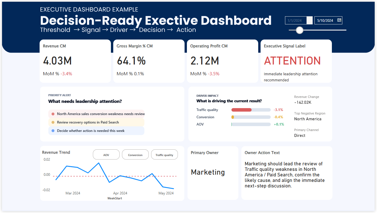
Thresholds, signals, and drivers make it easier to interpret performance consistently.
Not every dashboard supports this kind of decision-making. A decision-supporting dashboard needs more than clean visuals and accurate data. It needs to be intentionally designed for interpretation and action.
In practice, that means including elements such as:
- Thresholds that define when a KPI becomes concerning
- Signals that reveal when a pattern deserves attention
- Driver relationships that connect top-line results to likely causes
- Priority structure that tells people what matters most first
- Action cues that indicate what kind of follow-up should happen
This does not mean the dashboard should become a rigid machine that tells people exactly what to do in every situation. It means the dashboard should reduce unnecessary ambiguity by embedding the context the organization has already learned.
That context might include what counts as risk, what usually drives performance, which combinations of signals are serious, and which thresholds deserve a response.
The more that logic is externalized into the dashboard, the less the organization depends on individual memory, intuition, or interpretation under pressure.
Can This Be Perfect From the Start?
Of course not.
Just as a personal umbrella rule may need revision, business thresholds and decision rules also need testing. A team may discover that one threshold is too sensitive, another is too late, or a supposed driver was not as influential as expected.
Data-Driven Decision Making is not a one-time design exercise. It is a process of learning.
But that is exactly why dashboards matter so much. They create a place where learned context can be made visible, refined, and reused.
Even if the first version is not perfect, a dashboard with thresholds, signals, and driver context can still do something extremely valuable: it can help teams reach clearer decisions faster than before.
And for many organizations, that is already a major improvement over a dashboard that only shows numbers and leaves everyone to build meaning on their own.
From Reporting to Decision Navigation
This is why I believe the future of dashboards is not just better reporting.
It is better decision navigation.
Many dashboards are still designed like data libraries: rich, impressive, and full of useful information. But in moments of pressure, decision-makers do not need a library. They need a system that helps them understand what deserves attention, what it likely means, and where to act first.
Dashboards should not only show data. They should show the context that turns data into decisions.
Want to See What This Looks Like in Practice?
Explore dashboard examples designed around KPIs, thresholds, driver relationships, and decision structure.