
Actionable Dashboard Isn’t Enough: The Missing Structure Behind Decisions
Many dashboards are “actionable” in theory—clear charts, clean KPIs, easy to read. And yet action still doesn’t happen. The problem isn’t awareness. It’s the missing structure that turns noticing into acting.
- What “Actionable” means
- Why action still doesn’t happen
- Actionable ≠ Structured
- 4 structural elements
- How to make dashboards truly actionable
- Understanding vs implementation
- See a Power BI example
- Choose your next step
Working definition: An actionable dashboard helps people understand what changed and what it might mean. A decision-ready dashboard helps people know when it’s enough to act, what to look at first, and what action is being framed.
What most people mean by “Actionable Dashboard”
When people search actionable dashboard, they’re usually not asking for a new chart type. They’re asking for relief from the same situation:
- “I want to improve my dashboards to make them really useful.”
- “I am asked to add more visuals on the dashboard again, and I don’t know what to do.”
- “I can see the numbers, but I still don’t know what to do.”
- “We keep reviewing the same KPIs, but decisions don’t move.”
- “The dashboard looks fine—yet priorities are always unclear.”
In other words, “actionable” often means: clear enough to discuss, fast enough to check, and reliable enough to reference. That’s valuable—but it’s not the same as creating action.
Why action still doesn’t happen—even with an “actionable” dashboard
Most hesitation lives in the space between different and enough. Teams notice change. They pause. Then they wait to see if it changes again.
This is why meetings often end with: “Let’s review this again next week.”
Not because people don’t care. Not because the visuals are unclear. But because the dashboard doesn’t create a decision moment.
- No trigger: there’s no shared rule for when change becomes action.
- No order: people don’t know what to check first, so attention scatters.
- No framing: insights appear, but next actions remain undefined.
If this feels familiar, you may want to start with the Symptoms hub: See common decision breakdown symptoms →
Actionable ≠ Structured
Here’s the simplest distinction:
- Actionable dashboards optimize for noticing.
- Decision-ready dashboards optimize for acting.
An actionable dashboard can be clear and still produce hesitation—because clarity alone doesn’t decide: what matters most, when the signal is strong enough, or what action the team is actually choosing between.
Decision-ready dashboards keep attention on what truly drives performance when judgment is weakest. That’s not a design trend. It’s a decision structure.
The 4 structural elements that turn noticing into acting
You don’t need more KPIs. You need a structure that makes action inevitable. These four elements are the backbone:
1) North Star (Purpose Anchor)
A decision-ready dashboard starts with a single anchor: what this dashboard is protecting or improving. Without that anchor, every KPI looks equally important.
Related: North Star Metric →
2) Driver Ranking (Attention Order)
Teams don’t fail because they lack metrics. They fail because attention has no order. Driver ranking answers: what is driving the result right now—so people stop scanning.
Related: Judgement → · Decision Flow →
3) Weekly Triggers (When to Act)
“Variance” is not a trigger. A trigger is a shared agreement that defines when noticing becomes acting. This is where decision-ready dashboards quietly outperform “actionable” ones.
Related: Trigger → · Threshold →
4) Action Framing (What to Do Next)
Most dashboards stop at explanation. Decision-ready dashboards go one step further: they frame the decision into options—so the team can move.
- What are the likely causes?
- What actions are available this week?
- What do we watch to confirm the decision was right?
Related: Decision Structure Guides →
How to make an “actionable” dashboard actually drive decisions
You don’t have to rebuild every report from scratch. Most of the work is taking an existing actionable dashboard and giving it a clearer decision spine. A simple sequence is often enough:
- Start with one recurring decision. Pick the weekly or monthly decision this dashboard is supposed to support.
- Declare the North Star. Make it explicit what this page is protecting or improving—revenue, margin, active users, capacity, etc.
- Rank the drivers. Choose the 3–5 drivers that most often move the result and place them in a clear, visual order of impact.
- Set a trigger rule. Agree on thresholds that turn “watch it” into “we act this week.” Write them in plain language near the KPI.
- Frame one decision lane. For each trigger, define the likely causes, default actions, and what you will look at next week to confirm the decision.
When teams follow this pattern, the dashboard stops being “a place to browse KPIs” and becomes “the place we go to decide what happens this week.”
Understanding vs Implementation: why “knowing” doesn’t change behavior
Most teams don’t need more explanation. They need a path they can operate. That’s why there’s a real gap between understanding and implementation:
- PDF helps you name the structure.
- Book helps you internalize the logic across situations.
- Workshop helps you apply it to your metrics and cadence.
- Template helps you implement the structure immediately—without rebuilding from scratch.
This isn’t about selling. It’s about acknowledging reality: implementation is a different kind of work.
Common questions about actionable dashboards
Q. Is an “actionable dashboard” the same as a performance dashboard?
Not always. Many performance dashboards track KPIs, but they don’t define when a result is “enough to act” or what to do next.
Q. How many KPIs should an actionable dashboard show?
You can monitor many metrics, but the decision structure should highlight a small set of drivers and one clear North Star.
Everything else supports the story, instead of competing for attention.
Q. Can I make existing dashboards more actionable without rebuilding?
Yes. Often you can keep the visuals and add structure: a visible North Star, a ranked driver area, trigger rules, and a short action lane.
A Power BI example: from noticing to acting
Understanding the structure is one thing. Seeing it implemented in a real sales dashboard is different.
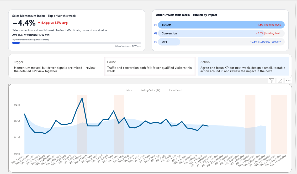
This Power BI template shows:
- A defined starting signal
- Ranked drivers by impact
- Built-in action framing
- A complete flow from “what changed” → “why it changed” → “what to do next”
Explore the full Decision-Ready Premium Template →
Choose your next step based on your current situation
Pick the lightest step that moves you forward. You don’t need to “commit.” You just need the next structure.