
Premium Template
Premium Power BI Sales Dashboard Template (Decision-Ready Design)
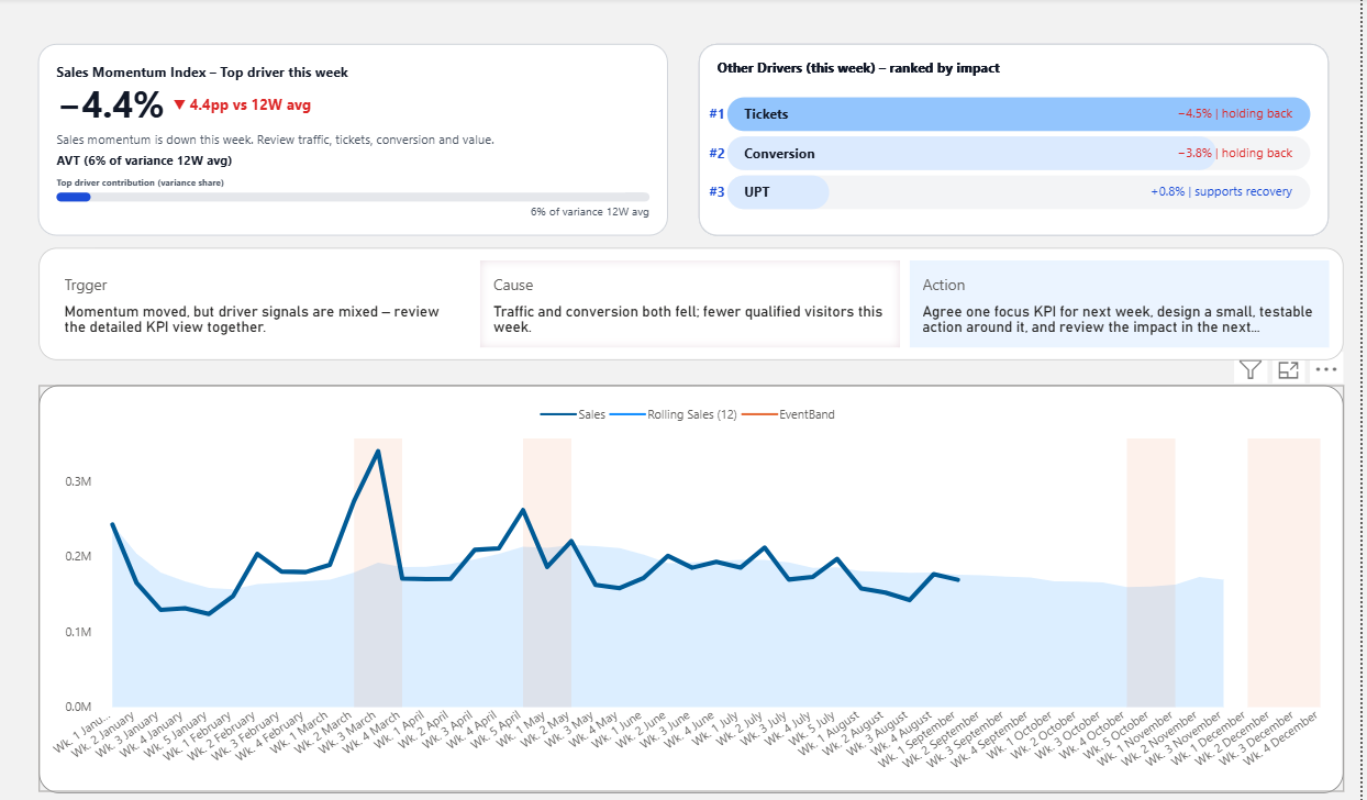
This is not just another sales dashboard layout. It is a Power BI sales dashboard template designed to improve KPI clarity, reveal likely drivers, and help weekly business reviews move toward better decisions faster.
Interactive Power BI Dashboard Preview
Explore the interactive version of this dashboard to see how KPI signals, driver impact, and weekly trends appear in a real decision-ready report.
This preview shows the structure and interaction of the dashboard. The template download includes the full editable Power BI file (.pbix).
Designed for what happens after the dashboard opens
Most dashboards are judged by how they look. But the real test is what happens in the meeting, the review, or the report discussion afterward.
This template was designed for that moment. It helps people identify KPI condition, see which drivers are pulling results, and move the conversation toward clearer action.
- Clear KPI status view
- Driver ranking structure
- Trigger, Cause, and Action review logic
- Better support for weekly review conversations
Why this dashboard feels different from typical templates
Typical templates often help you decorate reporting. This template was built to improve what reporting leads to.
Typical sales dashboard templates
- Show many KPIs at once
- Focus on visual completeness
- Leave business interpretation to the presenter
- Often create more explanation during meetings
- Useful for reporting, but limited for action alignment
This decision-ready template
- Clarifies KPI condition quickly
- Shows which drivers matter most
- Helps focus business attention earlier
- Supports clearer review discussion
- Makes the report feel more actionable
What this template helps you do
People rarely say it this directly, but this is often what they want from a better dashboard: less confusion, less repetitive reporting, and a more useful weekly review.
Improve report quality
Make KPI review easier to read and easier to explain without relying entirely on verbal interpretation.
Improve meeting quality
Reduce time spent deciding where attention should go and make weekly review more focused from the start.
Improve decision quality
Surface likely drivers and make the next business conversation easier to structure around what matters most.
What changes when the structure changes
If your current dashboard already looks polished, that is a good start. But polished design alone does not always improve business review.
The biggest shift often comes from structure: which KPI is elevated first, how thresholds are implied, whether likely drivers are visible, and whether the report naturally leads toward a clearer next step.
That is what this template is built to improve.
Purchase
Bring a more decision-ready structure into your sales review
Get the premium Power BI sales dashboard template and start from a layout designed to improve KPI clarity, driver visibility, reporting quality, and weekly business discussion.
Choose Your Purchase Option