
Description
Build a Power BI Dashboard That Actually Drives Decisions
Two professional Power BI dashboard templates built with Deneb – not “pretty report layouts,”
but working decision systems. These templates show exactly how metrics, ranked drivers, and decision flow work
together in a real weekly business review so your team can stop saying
“Let’s monitor it again next week.”
Built with Deneb
Full DAX included
Sales & driver review
Decision-ready structure
What This Template Actually Solves
Most Power BI dashboards already look “good”. The visuals are clean, the KPIs are there, variance is highlighted,
and filters work. Yet weekly meetings still end with:
“Let’s review this again next week.”
The problem isn’t data quality or visualization tools. The problem is that the dashboard is
reporting-ready, not decision-ready. It shows what changed, but it doesn’t tell the team:
- When is this change big enough to act?
- Which driver should we look at first?
- What decision are we actually choosing between this week?
These templates are designed to solve exactly that gap. They don’t just visualise metrics.
They organise attention, sequence, and action so a weekly review can move from “interesting”
to “we know what we’re doing next.”
Who This Is For
- Power BI developers using Deneb (or ready to start) who want a real, editable reference.
- Analysts who can already explain “what changed” but still struggle to pinpoint
what matters most each week. - Teams stuck in recurring KPI review meetings with no clear owner, decision, or next step.
- Leaders who want a consistent weekly decision flow instead of ad-hoc conversations around charts.
- Anyone building dashboards meant to support decisions – not just report results.
Not a Fit If…
- You only want plug-and-play visuals with zero editing or adaptation.
- You expect the dashboard to “automatically know your business” without adjusting the logic or drivers.
- You’re looking for a generic styling pack or gradient theme – this is structure-first, design second.
- You never run recurring performance or sales reviews and don’t need a weekly decision rhythm.
If you want a template that shows exactly how to turn a weekly review into a decision,
this pack is built for that job.
What’s Included
When you download the Decision-Ready dashboard pack, you’re getting more than two PBIX files.
You’re getting a complete reference implementation of a weekly decision structure you can study, reuse,
and adapt to your own KPIs.
- Two full PBIX files – fully functional, ready to explore, no rows removed or simplified examples.
- Full DAX measures used by the dashboards, so you can inspect or adapt the logic.
- Deneb specifications – working, editable Vega / Vega-Lite specs with hierarchy and emphasis preserved.
- Dashboard structure diagrams to show how signal, drivers, and action flow are embedded into the layout.
- Setup walkthrough video so you can install, open, and start learning fast.
Everything is provided exactly as used in real business reviews – no “PowerPoint mockups” or simplified demo data.
Reporting-Ready vs Decision-Ready
A lot of “professional Power BI templates” stop at clean visuals. This one goes further and shows you
how to embed a decision structure directly into the page.
Typical reporting-ready dashboard
- Many KPIs, each styled to look important.
- Variance and trend charts, but no clear starting point.
- Teams scan for “what looks interesting” and jump between charts.
- Most meetings end with “let’s monitor this again next week.”
Decision-ready dashboard in this template
- A single Sales Momentum Index that anchors the review.
- Driver KPIs are ranked by impact, not just listed side-by-side.
- Visual triggers define when a change is “enough” to act, not just “different.”
- Built-in action framing so the team can agree on a next step during the meeting.
The goal isn’t to add more charts. The goal is to give your team a predictable way to move from noticing a change
to deciding what to do next.
Inside the Pack: The Two Dashboards
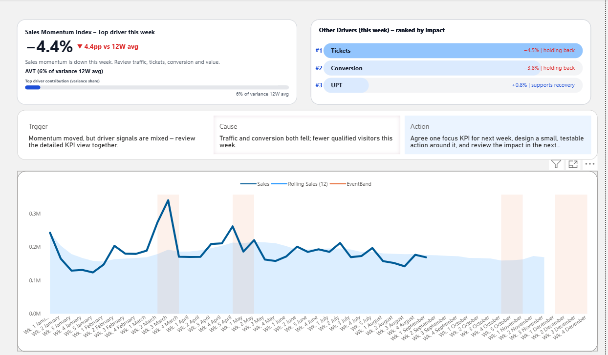
1) Sales Momentum Dashboard
Designed to answer one uncomfortable question clearly:
“Is performance gaining or losing momentum – and why?”
- Sales Momentum Index + context view so you can see trend and level at a glance.
- Driver contribution view (tickets, conversion, UPT, value) to show which lever moved this week.
- Rolling 12-week context so one noisy week doesn’t hijack the conversation.
- Signal → Cause → Action framing built into the layout to support a focused decision.
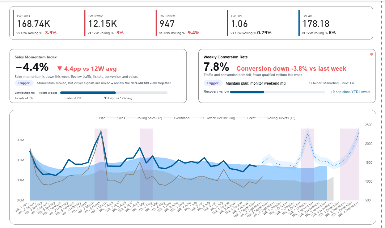
2) Driver Deep-Dive Dashboard
When one driver needs more attention, this dashboard keeps the structure but narrows the lens so you can see
where momentum is breaking.
- Ranked driver KPIs with impact bars so you can see “what moved the needle” first.
- Weekly pattern and cohort views to spot whether the issue is timing, mix, or quality.
- Macro vs micro framing – see the big picture, then zoom into the specific driver in question.
- Notes space structured around trigger, hypothesis, and action so follow-up doesn’t get lost.
How a Weekly Review Looks with This Template
Here’s how a typical weekly meeting changes once the dashboard is built around signal → drivers → action.
The team opens the Sales Momentum dashboard and looks at one question:
“Are we gaining or losing momentum vs our 12-week baseline?” No hunting through multiple charts.
If momentum moved, the driver ranking shows which KPI contributed most. Attention is guided in order,
not spread across every chart.
The built-in action panel captures likely causes and concrete options for this week, not abstract ideas for later.
The team agrees on a small, testable action and what they’ll watch next week to see if the decision worked.
The template doesn’t replace judgment. It makes judgment easier by structuring when to worry, where to look first,
and how to turn insight into a clear next step.
Adapting the Template to Your Own KPIs
Every organisation has different metrics, but the decision structure is surprisingly consistent.
The pack is designed so you can keep the structure while swapping in your own KPIs.
- Use the existing Sales Momentum Index as a pattern to define your own primary signal.
- Map your key drivers into the ranking view – keep the logic “what drives this week’s result most?”
- Adjust thresholds and trigger rules so they match your business cadence and tolerance.
- Reuse the action framing layout to make sure every review ends with a decision, not just a conclusion.
You don’t need to copy the visuals pixel-perfect. The real value is seeing how the structure works so you can
apply it to your own domain – sales, marketing, operations, or anywhere momentum matters.
Frequently Asked Questions
Do I need to be an advanced Deneb user?
No. The templates are designed as working examples. You can use them as-is, or gradually open the Deneb specs
to see how the visuals are built. Basic familiarity with Power BI and measures is enough to start.
Can I use this without rewriting my whole model?
Yes. You can connect the templates to your existing data model or mirror the key measures.
The goal is to bring the decision structure into your current environment, not force a complete rebuild.
Is this just for sales?
The examples use sales-focused metrics, but the logic works for any area where you track momentum and drivers:
marketing campaigns, subscriptions, store performance, operations and more. The structure is reusable even if
your KPIs are different.
What if I already have “actionable dashboards”?
Many teams already have dashboards that are clear and easy to read. This pack helps you move beyond
“actionable” to decision-ready – dashboards that keep attention on what truly drives
performance when judgment is weakest.
Start Using a Decision-Ready Dashboard This Week
If you’re tired of weekly reviews that end with “let’s monitor it again,” this template gives you a concrete,
working example of a dashboard that leads to decisions – not just discussion.
Download the pack, open it in Power BI, and see how a decision-ready structure feels in a real dashboard.
Then adapt it to your own KPIs at your own pace.
Reviews
There are no reviews yet.